The world’s population is aging. When the elderly reduce or stop driving, studies show there is only a small increase in public transport use. In a recent study by sciencedirect “while more than half the respondents were able to access buses, only half of those who had access would use them.”
So how are our elderly friends getting around?
...sadly, many of them aren’t.
Those who can’t afford regular taxis or don’t have family and friends they can rely upon for a lift quickly become isolated and stuck at home.
“Focus group discussions emphasised the importance of having a local social network as you age. Without local social support, older people can become both physically and virtually isolated.” Isolation is obviously detrimental to mental health, but it also becomes physically dangerous for those needing to travel to regular doctors appointments.
So what is stopping the elderly from using public transport? And where do you even start to design a solution to help empower companies to encourage people to just use it?
As a creative problem-solver, it is easy to jump straight to the solutions you could design to inspire people, or make assumptions in your head to explain why people are acting the way they are. But without first speaking to the people actually facing and living the problem, we will always miss key insights, pain points, or areas of opportunity to make the product better.
Design should never be based on assumptions, it should only be based on deep behavioural user evidence and data. During my time at Liftango I worked as part of a cross-functional team: leading designers, working with data scientists, sales, product managers and engineers working towards a common goal to solve the issue of challenging public transport for older people or people with special needs.
We thought we knew what the problem was, but had we objectively and empathetically investigated the problem space to work out the exact problems we were trying to solve? Sometimes you can be too close to the product that bias or assumptions can cloud and prevent the problem space being explored widely.
An essential part of the design process is to research your industry; find out what your competitors are doing and see what the latest and greatest design trends are. It’s important to identify what your competitor's strengths and weaknesses are so you can learn from their mistakes and wins.
One of my favourite design activities is to use blue-sky thinking. Gather all of the information, competitor analysis, design best practices, ideas, concepts you could possibly use (the sky is your limit) and then refine to uncover the hidden eagles flying under the radar. Something as simple as spelling out the key problem statements can also help those doves start to appear.
This is how I structure and think through my problem statements:
A [user role] who feels [negative feeling] about [reason] needs/wants to [step] but faces [obstacle].
For Passengers I wrote:
An aging person or person with special needs feels reluctant about using an app for community transport needs/want to find out more booking information in real-time but faces concerns about feeling comfortable using technology.
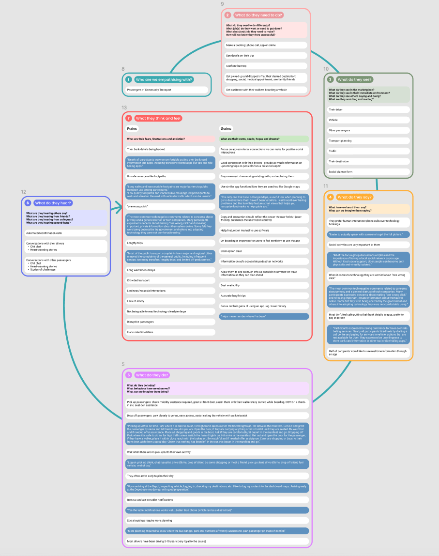
I needed to speak to three key user groups: those who operate the transport, those who use the transport, and those who drive the transport. I had to understand the problem from multiple points of view and discover the interview technique that worked best with each user group in order to extract the best results. I also needed to build out their personas based on quantitative and qualitative information to refer back to in order to help keep perspective and craft a delightful user experience.
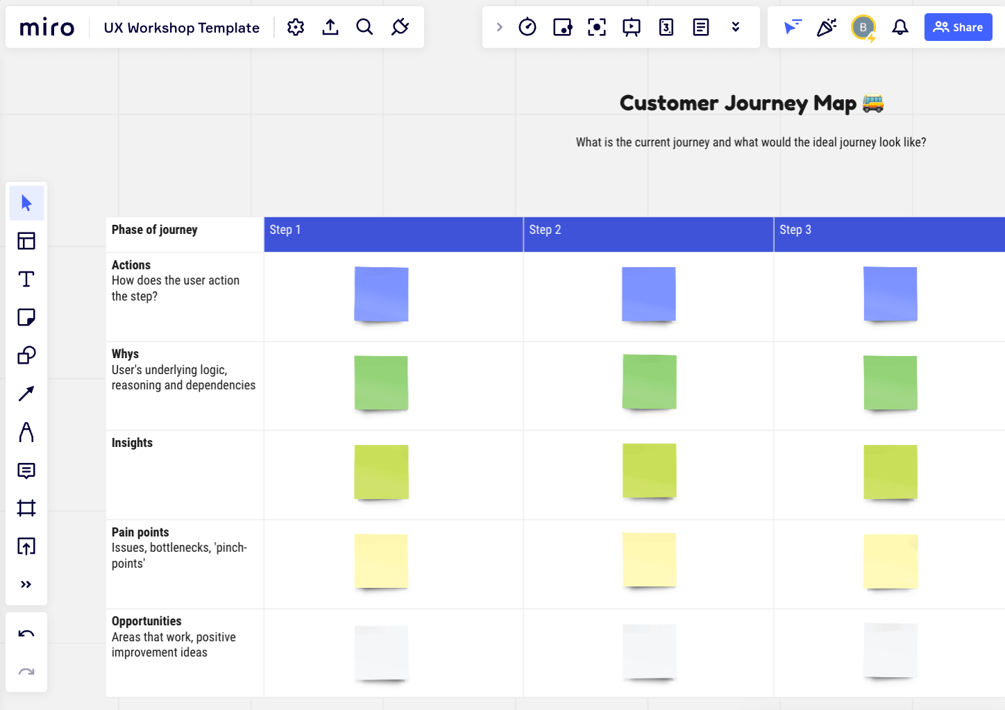
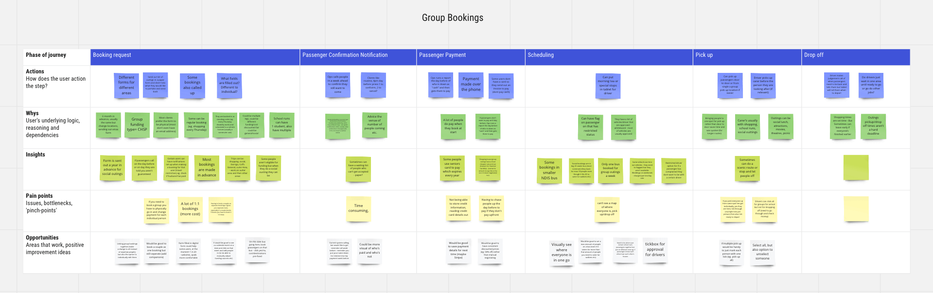
For the service operators group, I decided the best interviewing technique was to host a customer journey workshop and discuss the main tasks they complete day-to-day. I created the journey map using online whiteboard software Miro and facilitated it with the assistance of my junior designer. The aim of the workshop is to understand their current journey and what their ideal journey could look like. In small groups of three, I asked them to talk through the individual steps to complete each of their daily tasks and documented the insights, pain points and areas of opportunity to improve the experience.
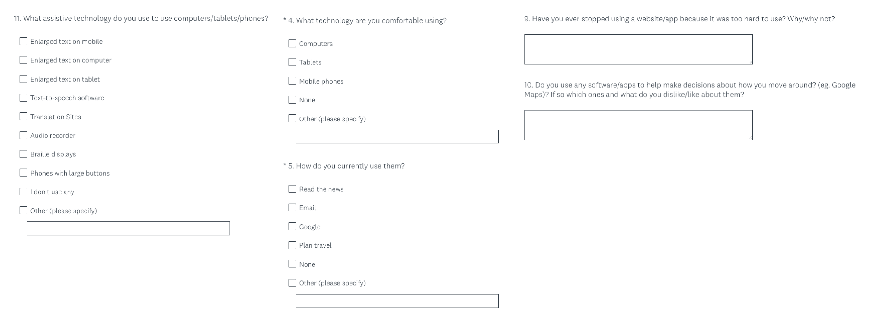
The next user group I targeted were the passengers. As we had no user groups to pull from, I created a survey through Survey Monkey to send to bought participants over 65 who used public transport. My focus was to unearth their patterns and behaviours: How often do they use public transport? What's their main destination? What do they find frustrating about the service? How do they use the service? What could help them? Etc. I wanted to uncover clues as to why people weren’t feeling comfortable enough to use public transport.
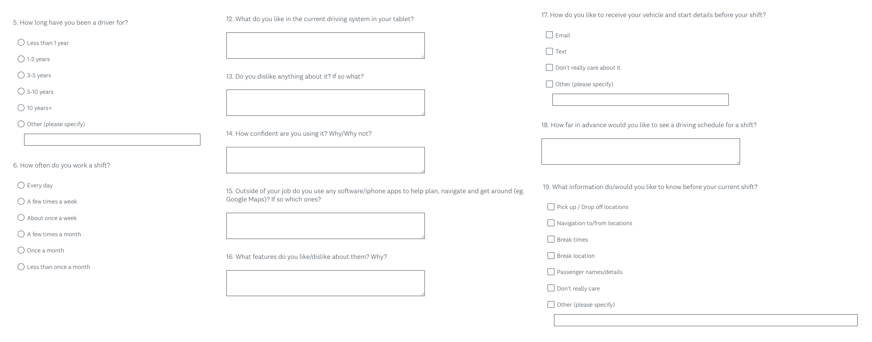
Finally, I wanted to talk to the drivers of public transport. Due to the large number of drivers, I again chose to conduct a survey to be time efficient.
I wanted to understand their patterns of behaviour, and what motivates and frustrates them in their job. I wanted to learn the elements I could inject into my designs to help empower workers, and continue to help those in need to live full lives. If there were tweaks I could make to my designs that would motivate them that little bit extra, I wanted to do it. If there was something I could add that could encourage someone who wouldn’t usually use public transport, I wanted to do it. My aim was to discover the missing ingredients, add it to the mixture, and use design to make the best user experience possible.
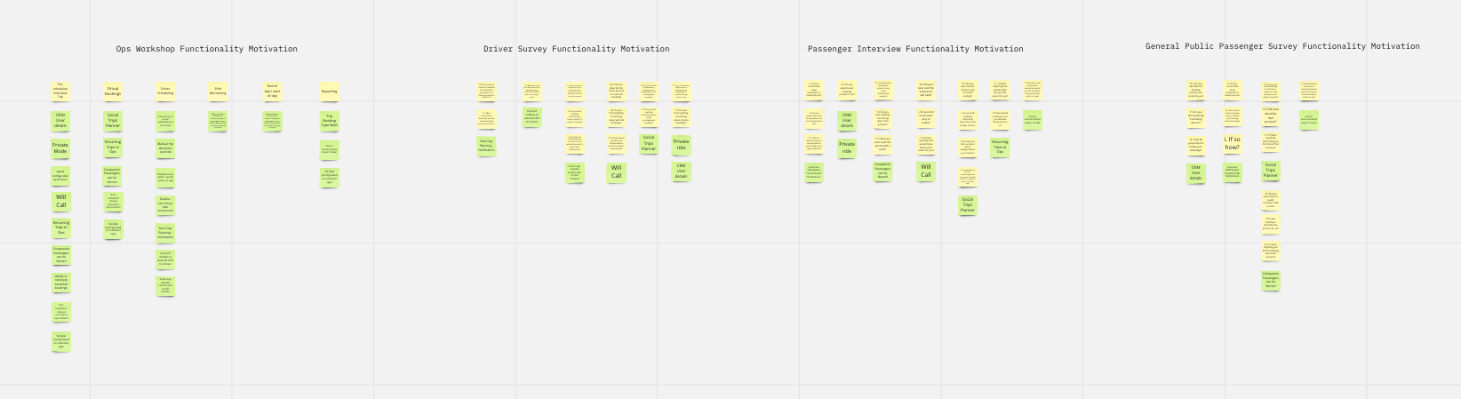
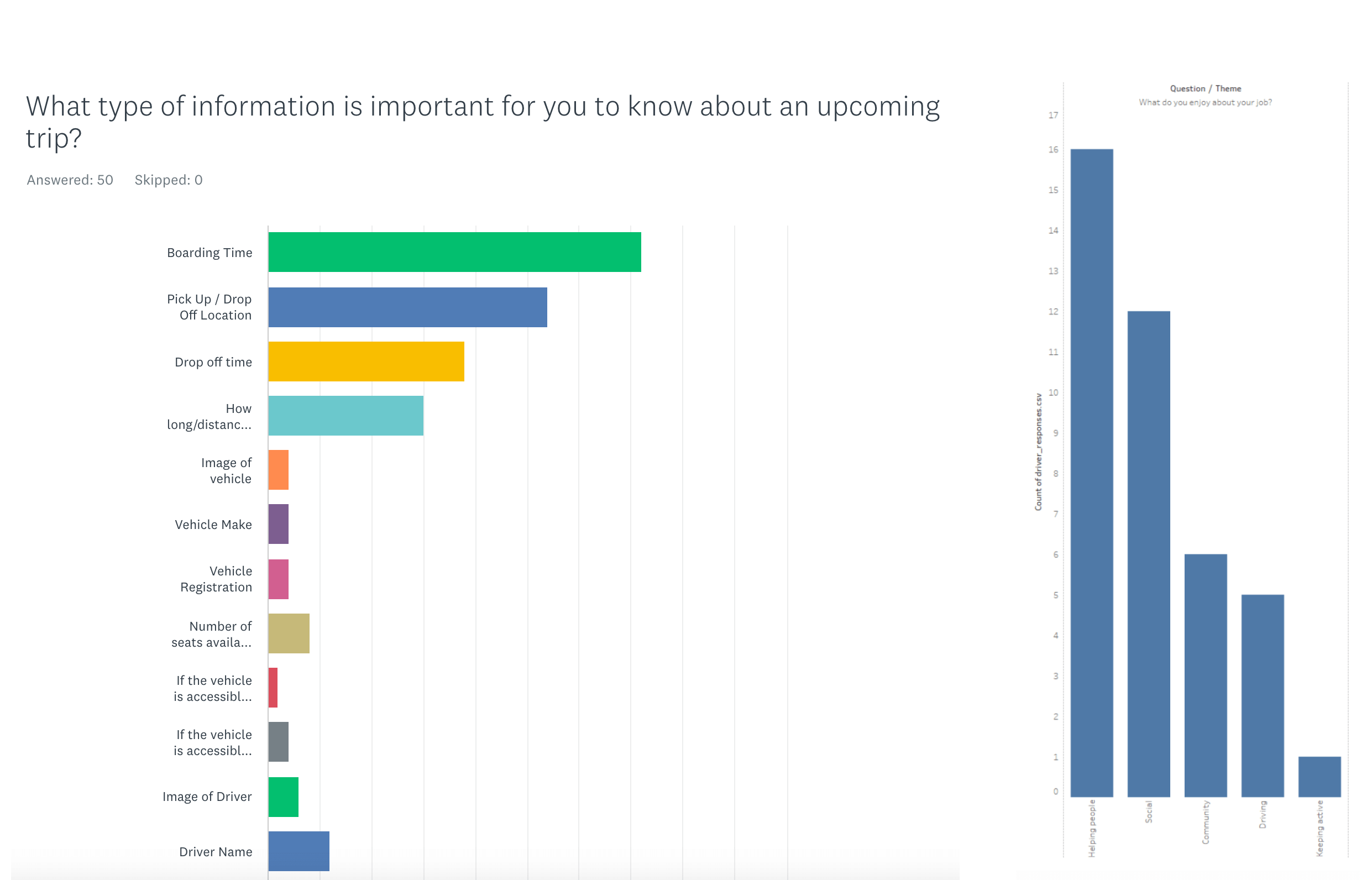
After all workshops and surveys were completed, I used a technique called Affinity Mapping to sort the information into groups of information that relate to one another. With the guidance of our expert data scientists, I looked for key themes and patterns in the open-ended answers and recorded them in a spreadsheet. After breaking down the results I created charts and graphs which reflected the amounts of people who answered with those key themed results.
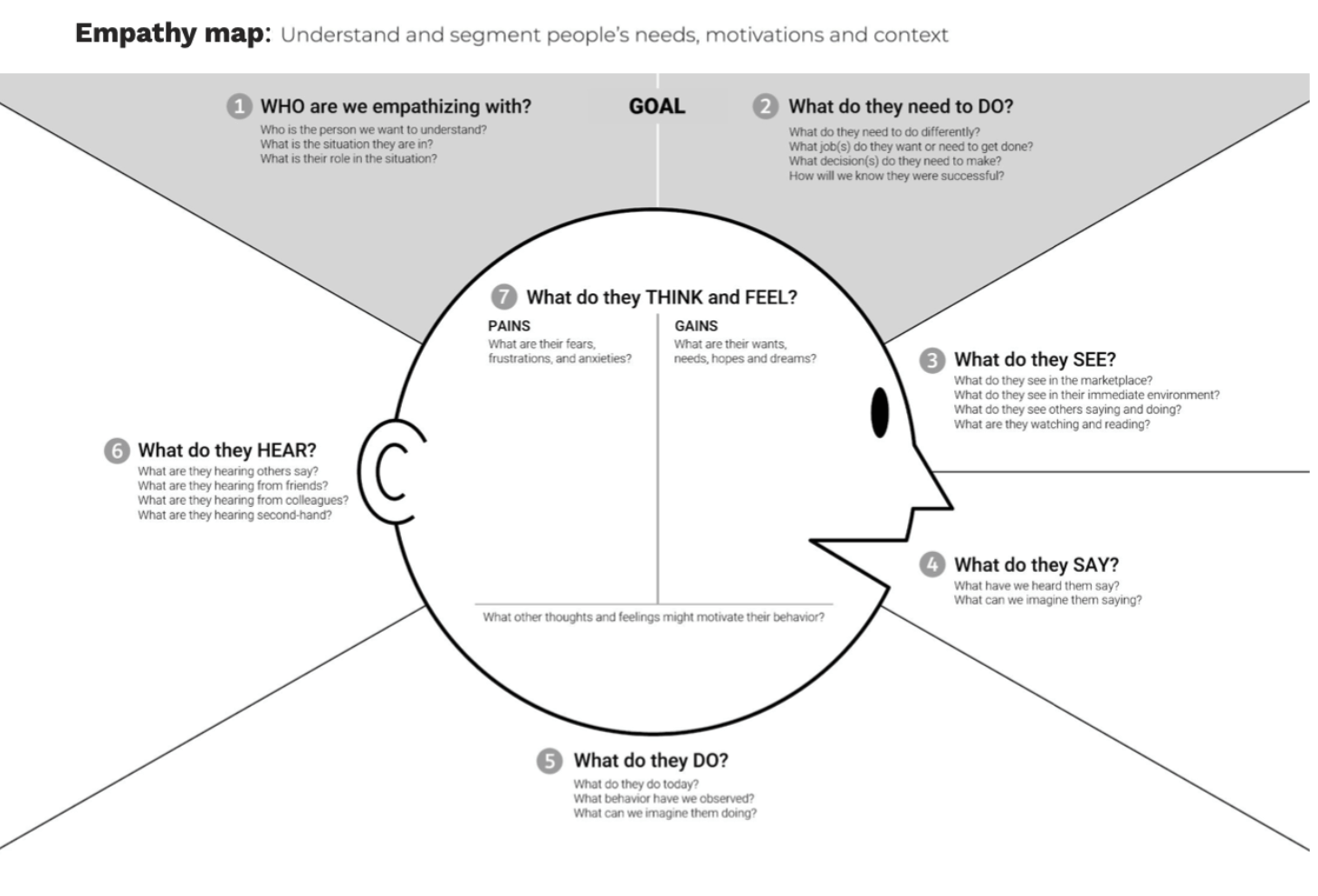
After analyzing the results, I used that information to step into the shoes of the user. When it’s someone’s birthday, do you just make a cake you like? Or do you find out their favourite flavour? Do you go one step further and find out their favourite colour? Some people might just pick a random cake, but you’d like to think most people would go that extra mile and choose a cake based on the preferences of the person celebrating. The same applies to design. We need to really dive deep into breaking down the perspective, wants and needs of the users we are designing for. Who are we catering to? What do they need to do? What do they need to see? What do they think and feel?
I like to use the empathy map created by Dave Grey as I love the illustration of the face you get to look at and think about as you fill out the information out. But it doesn’t always fit everything, so I created an expanded version in Figma.
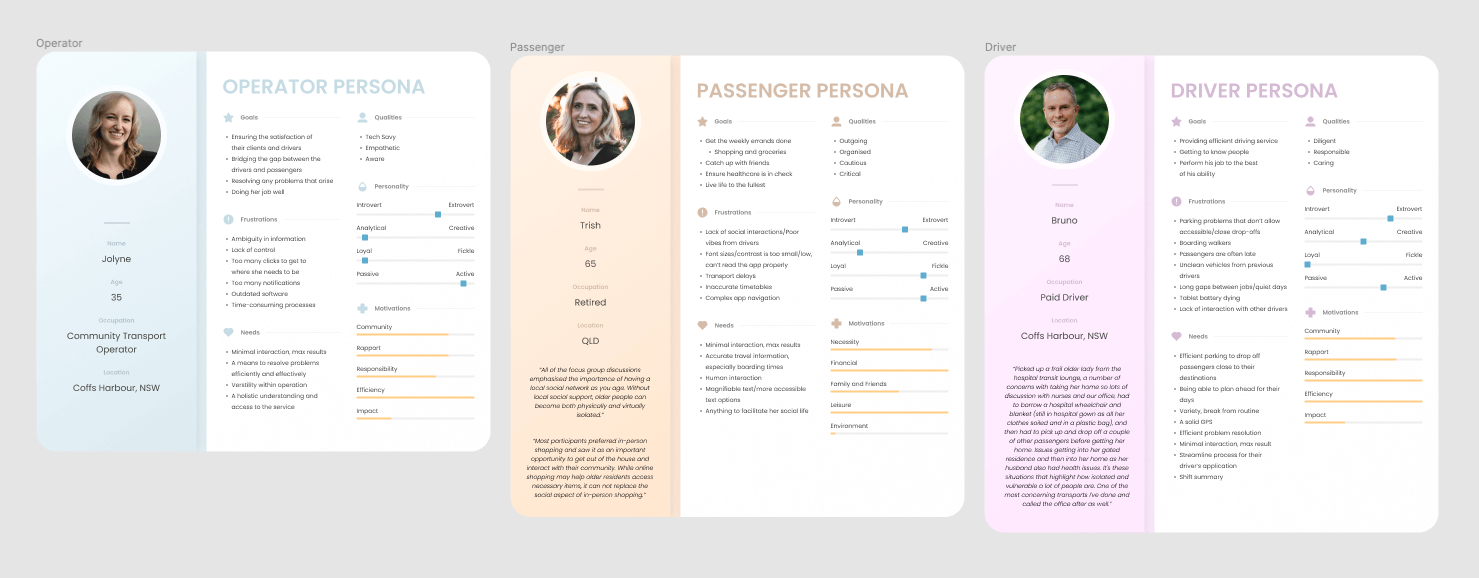
After finishing empathy mapping, I wanted to create a proto-persona snapshot and put a face to exactly who I was designing for. I used royalty-free imagery from Unsplash to represent the people I interviewed. I then pulled out the key goals from my empathy map, with pull-out quotes, so that while I’m designing I could constantly refer to the persona I created to keep me on the right path.
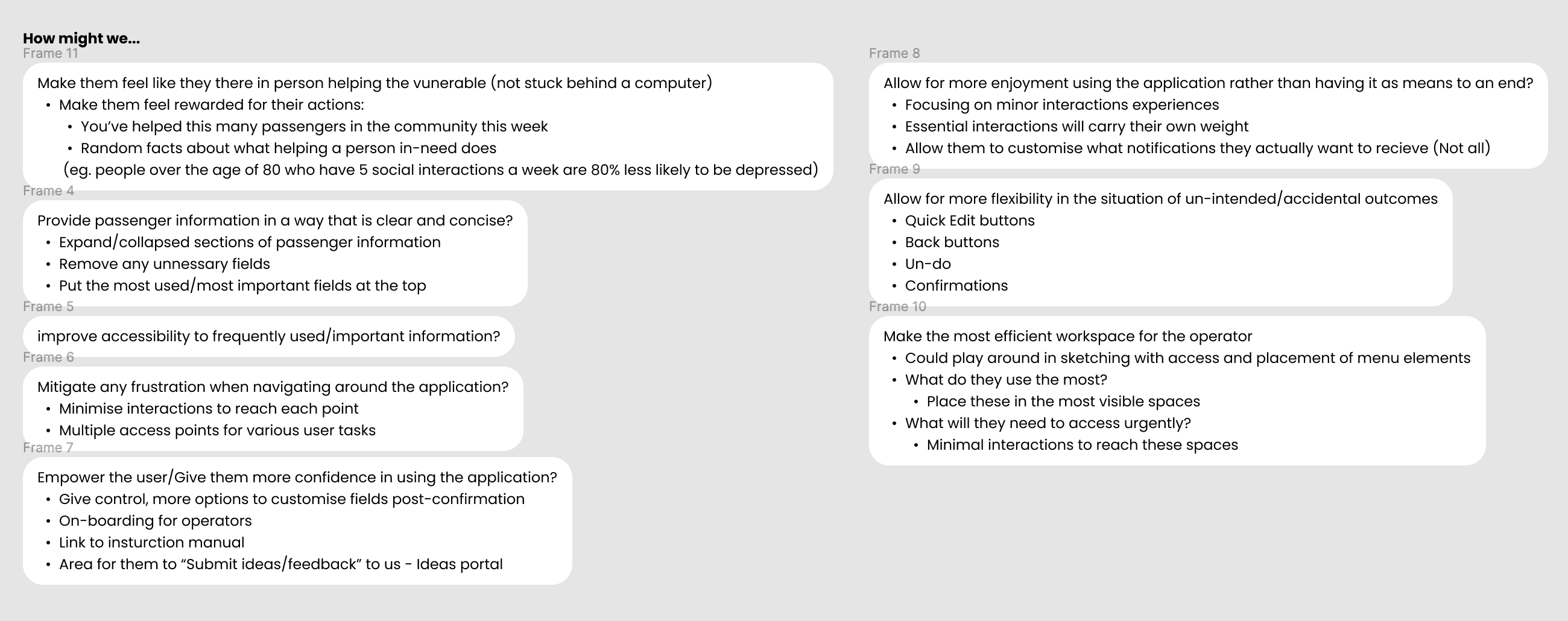
“How Might We” statements are the book-ends to problem statements. Now that I had finished the research, I wanted to rephrase my insights and problems by looking at them from a completely different angle. I wanted to open the door on potential ideas and expand them to solve the problems. I like to disconnect the medium I’m designing for and use perspective to force myself to focus on solving the issue. For example,how can I make a trip on public transport feel like a day at a resort?
Here’s the structure of how I write a “how might we” statement:
How might we [WHAT] for [WHO] so that [WHY]?
Here are a few of my “How Might We” statements:
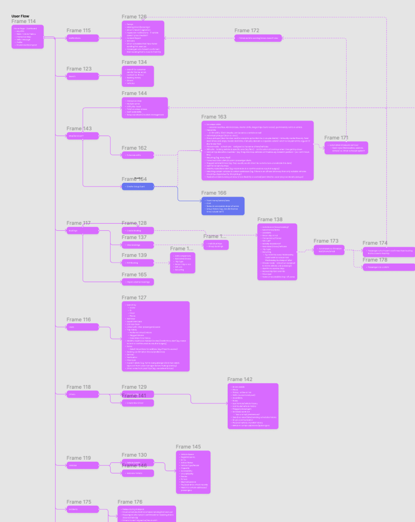
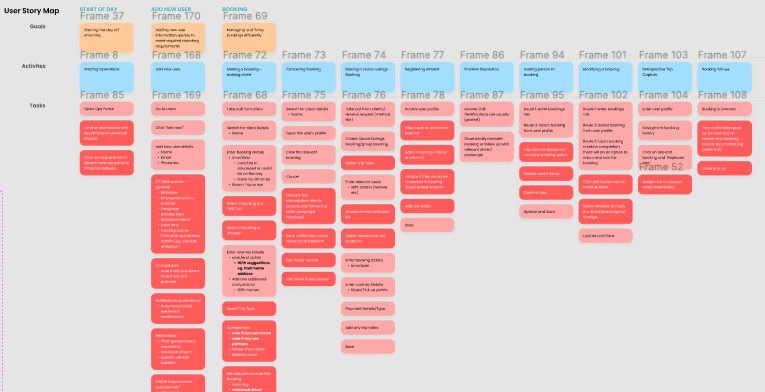
Next, I wanted to start forming the structure of the overall flow/blueprint of everything I needed to design. Using all of the ideas and information I had gathered, I wanted to visualise how they would flow together. Does this bit of information work sitting here? Should this appear connected to this area? Again, by thinking through the information architecture without being blinded by UI, you can focus on just the interactions of the user. Story mapping also allows you to think through each individual task, activity and goal needed for each part of the journey. You're basically writing the story outline of your designs.
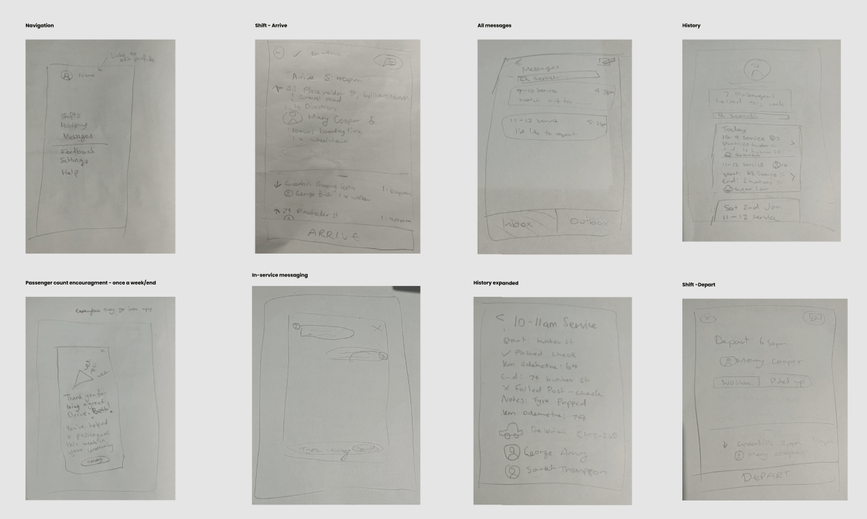
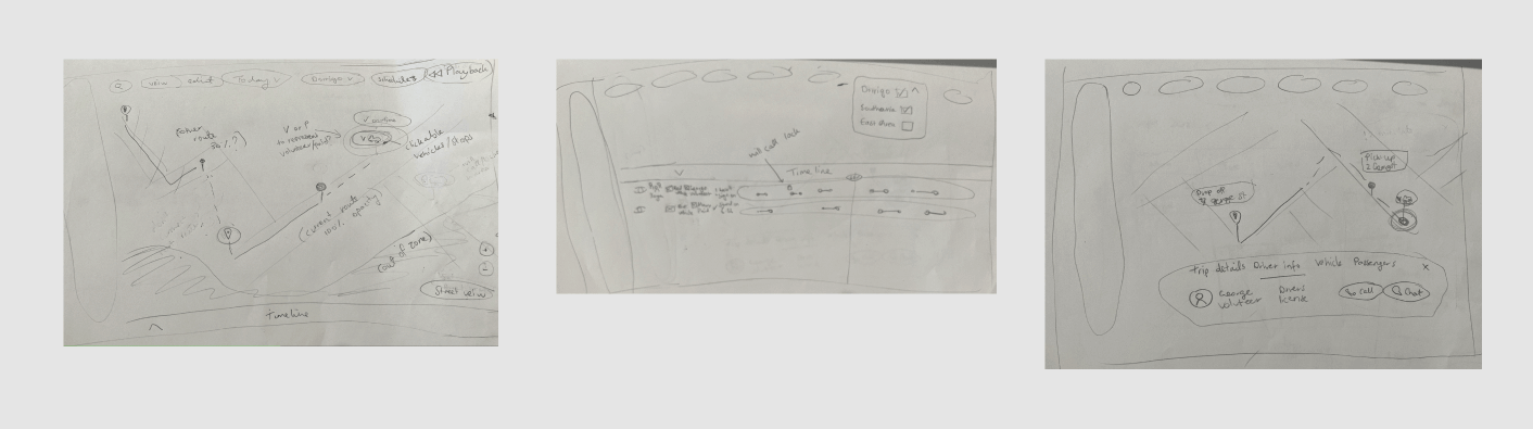
I think of myself as a bit of a messy creative baker during the process. My sketches are rough and messy but they are the building blocks to form what the final design will encompass. I can sketch out my ideas without being distracted by the colours I’m using or details like the rounded curves of my icons. I can purely just focus on the ideas I’m trying to form.
After sketching them, I believed our ideas were ready to show to the engineers to discuss if they could become a reality, or if there were any red flags or things they thought we should do differently for implementation. I love discussing design ideas from a development perspective before the final hand-over of designs as it helps put things in perspective and sometimes leads to ideas about extra functionality that could be added to bring extra value. As I have a background in development also, generally tech-talk doesn’t go over my head and I can understand their point of view.
Next, I started building the foundation and frames of the designs. The visual hierarchy of how things are positioned can be a make or break situation, so it’s important to really think about the layout before adding too much detail to the designs. It’s important to not be a perfectionist at this stage. You don’t want to waste time adding in unnecessary details that can be added later, you want to focus your energy into adding your key features and making sure they can sing in harmony next to one another.
Finally, I got to add colour to my paint-by-numbers! This is where all my hard work would come to life. Using Figma, I added colour and styling to all my wireframing and connected them in prototype mode to envision what it’s like to be able to use them in real-life. One of my favourite results to see come to life was hearing how driver’s number one motivation was to help their community. I applied some gamification to reward them by letting them know how many passengers they have helped for the week.
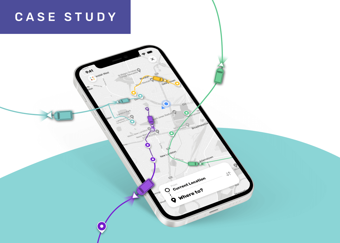
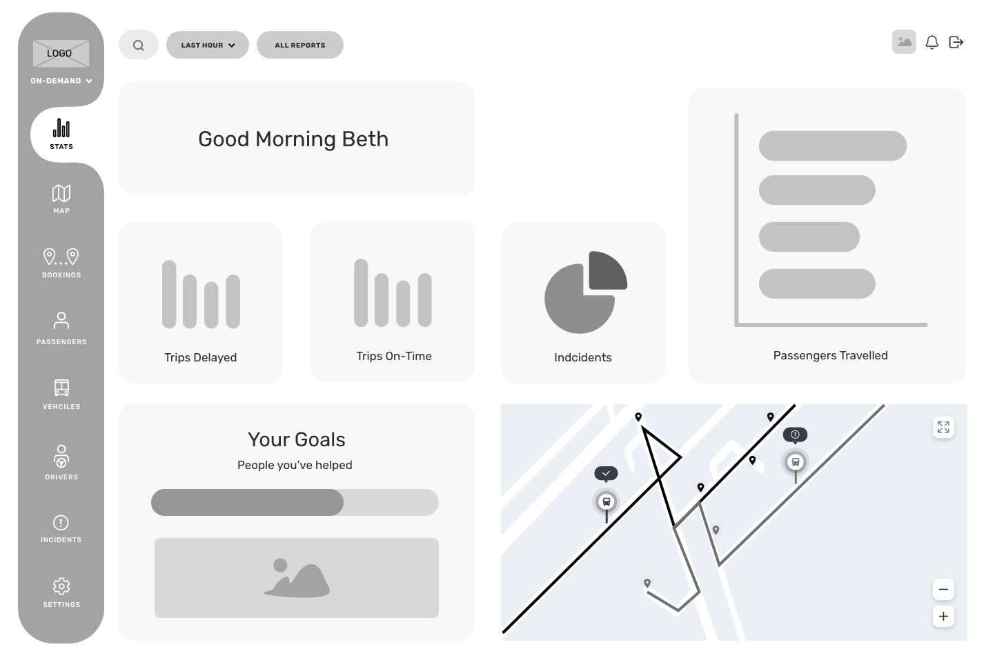
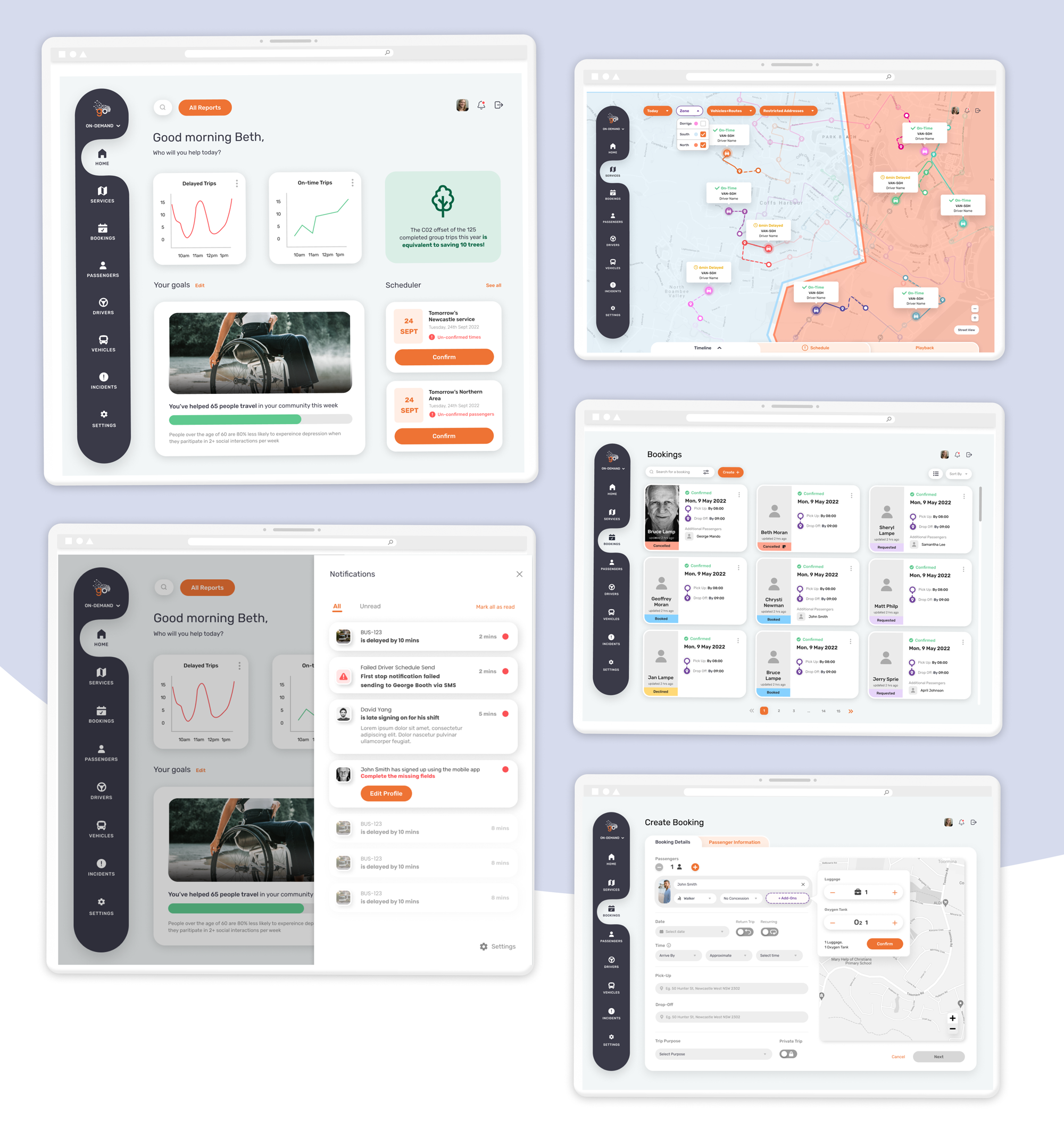
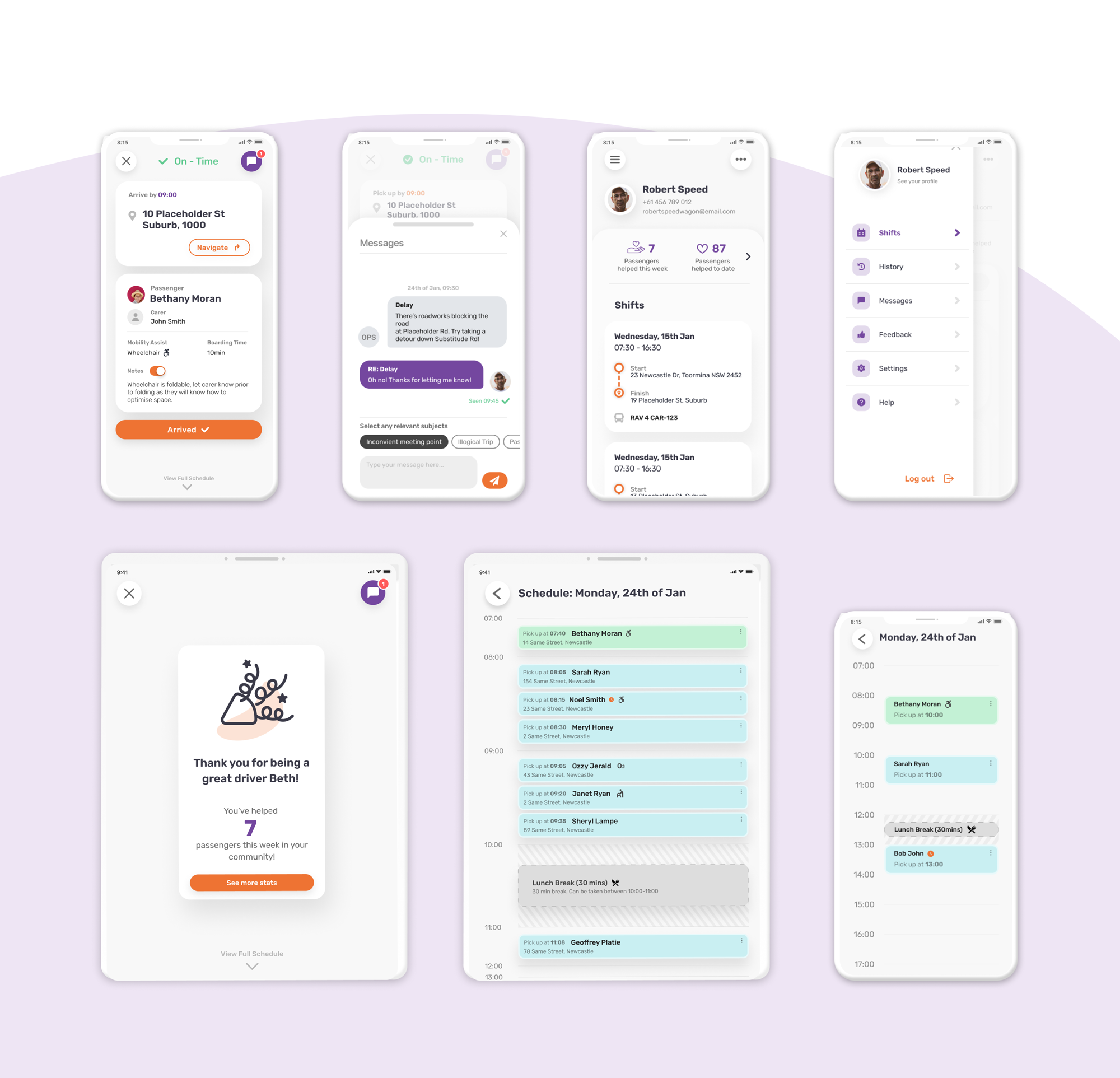
Here are a few highlights of the full products I designed:
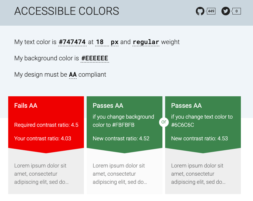
Regardless of what project I am working on, I always want to make my work is inclusive. There’s a whole list of tools and Figma plugins I use to make sure I am passing WCAG 2.1 accessibility compliance, but one website I visit regularly is accessible-colors.com to make sure my buttons are passing contrast standards. People who have vision impairments can find it harder to perceive two colours separately. So if your call to action “Buy now” button has a light coloured font on a light coloured button, they might not be able to read it. This can be detrimental to a business missing out on sales but also to the customer, who feels unfairly alienated from being able to make a purchase.
Before I could handover my work to be developed, I wanted to get real user feedback. Testing designs while they are still a prototype and not a fully finished product allows you to identify any red flag issues you may not have seen and eliminate them before the product is created, saving time and money. I decided to do two types of user testing. The first was to show the designs to the original operators of the service and get their experienced feedback. The other was to use a software called Usability Hub where you can upload prototypes and get a random-drawn audience to give feedback. The first would allow me to get insight from experienced people who currently use similar software everyday, the other would get that fresh-eye UX perspective.
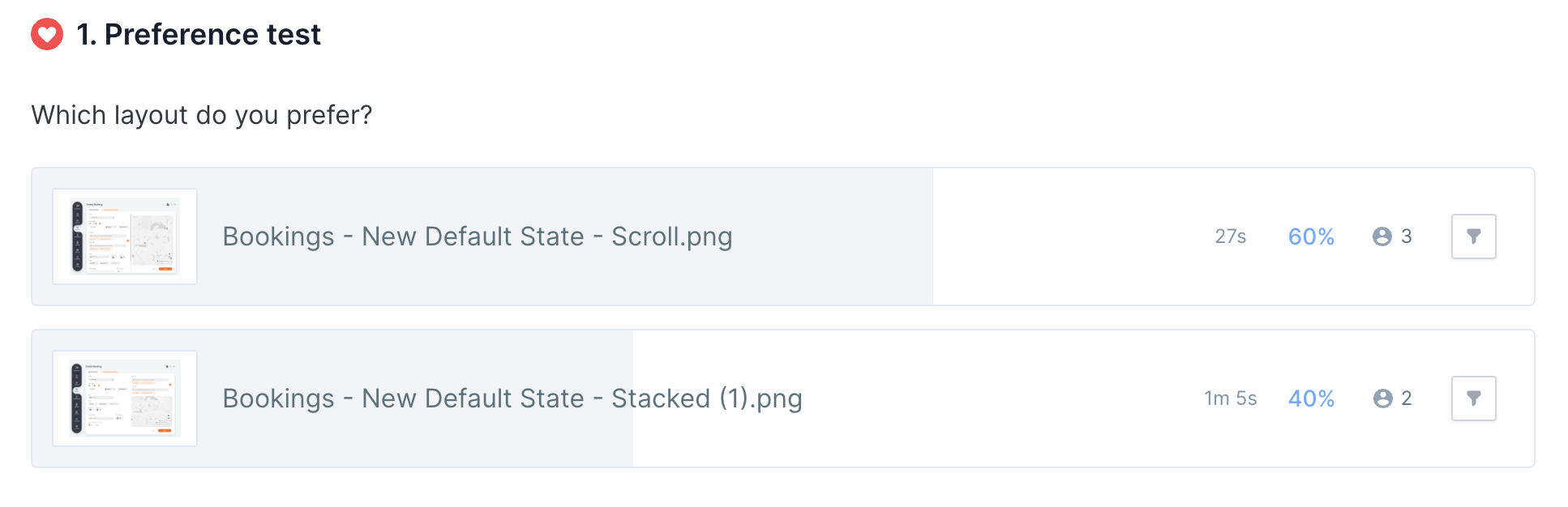
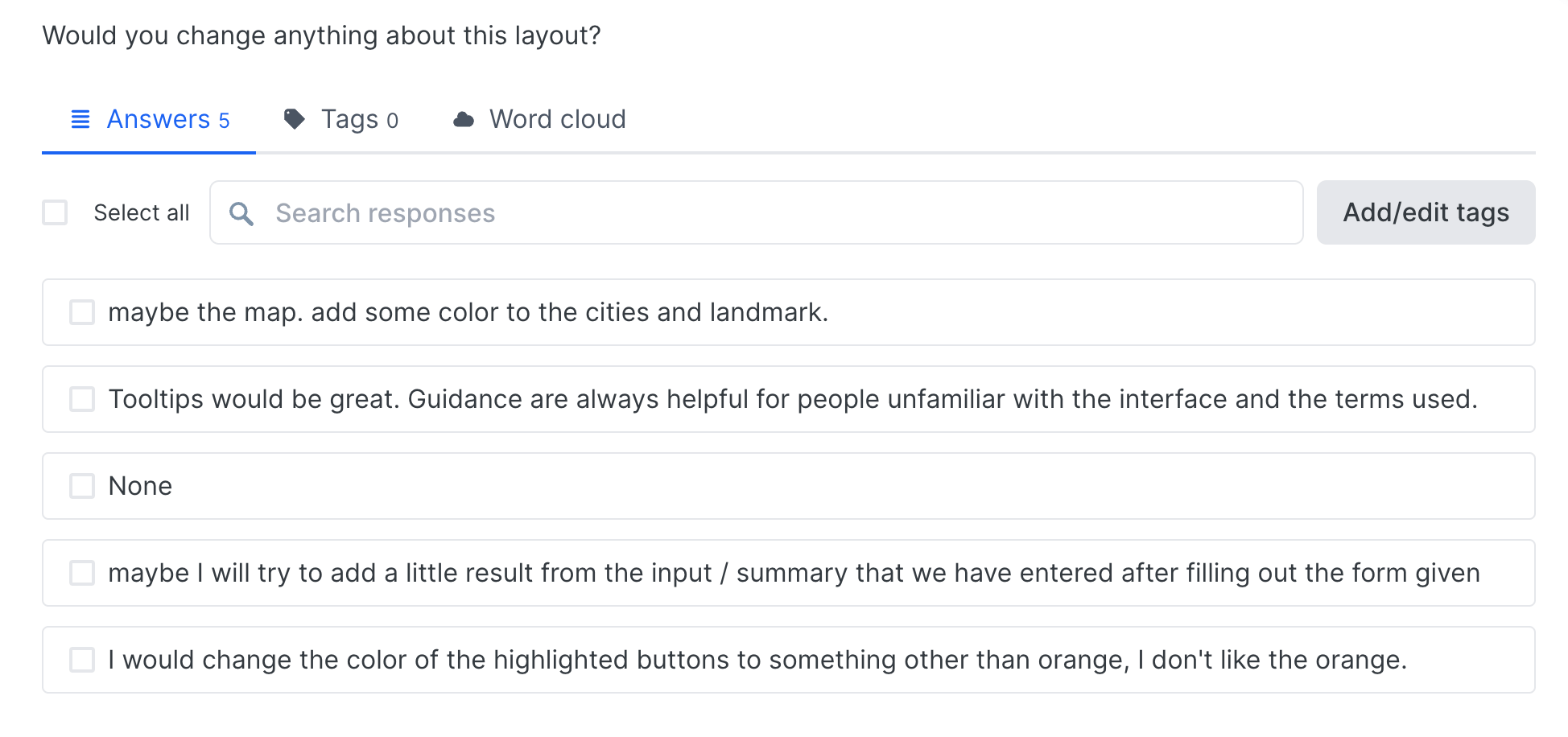
Using Usability Hub, I uploaded different A/B scenarios of layouts, icons, flows etc that I wasn’t feeling 100% sure on to get an outsider's perspective. I would take their reactions into consideration to inform the design decisions I made.
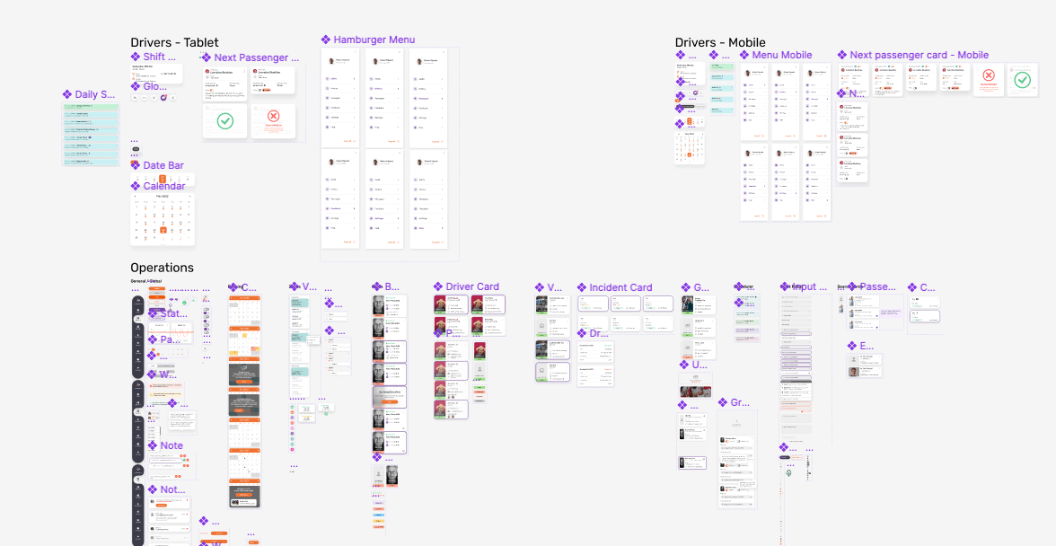
Once the designs were finalised, we had to create a central place where we could document and pull parts of the design from, like buttons, typography, and icons, to maintain consistency . We created a Design System component library in Figma where we outlined the design states for every part of the designs and linked them in. In the future, for example, to update the main branding colour, we only need to update it in one place and it would automatically update wherever that instance was used. We now had a single source of truth for designers, product managers, engineers, etc to reference the standard design specification of each design element.
I like to think anything I work on is never really finished. You always have to listen to feedback, adapt, grow and iterate. But I felt like I had put my heart and soul into this project to try and help people to the best of my ability to a) feel more comfortable using public transport, b) empower the operators to be able to do their job more efficiently and c) give drivers as much information as possible about passengers and their trips to help strengthen and inform them in their jobs and, most importantly, encourage them to keep helping their community.