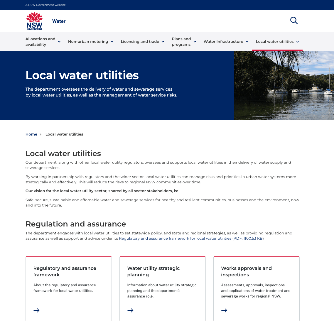
This UX case study details my work with the Australian NSW Government on the transformation of their Water Utilities, Floodplain Management, and Floodplain Harvesting websites. The journey unfolded with a mission to harmonise stakeholder desires with user needs. Focused on aligning project goals and understanding user needs, I led kick-off sessions to establish a clear vision with key stakeholders and subject matter experts.
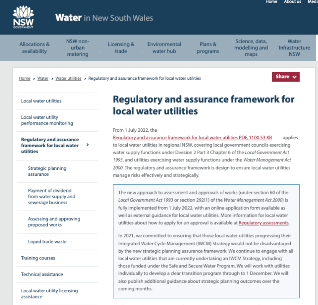
During the stakeholder discovery workshops, we found out that the main reason for launching this UX project was a common problem: stakeholders heard from users that finding content on the websites was tough. People found the words, especially those about regulations, too complicated. Additionally, there were issues like repeated content, old information, and outdated designs across the websites.
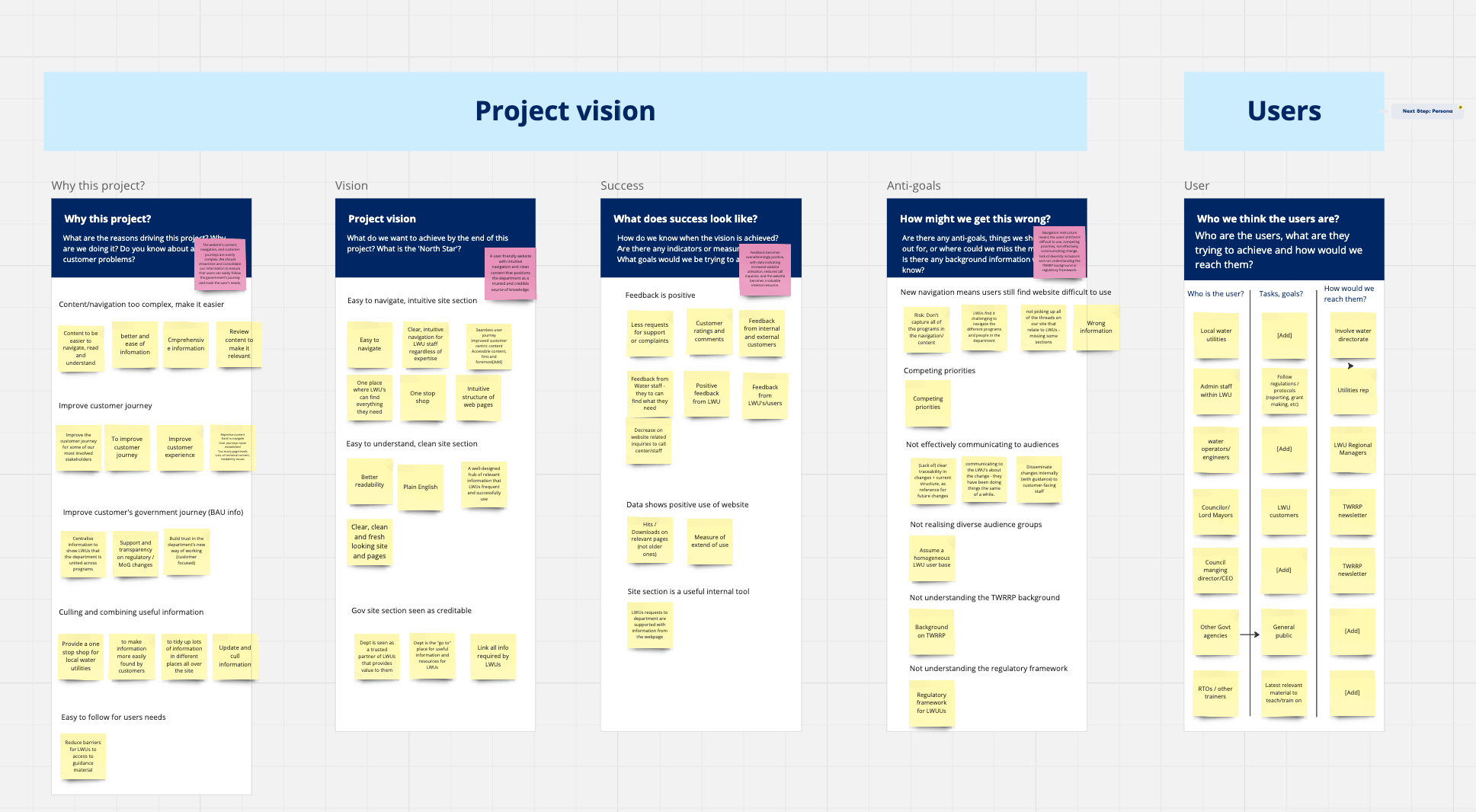
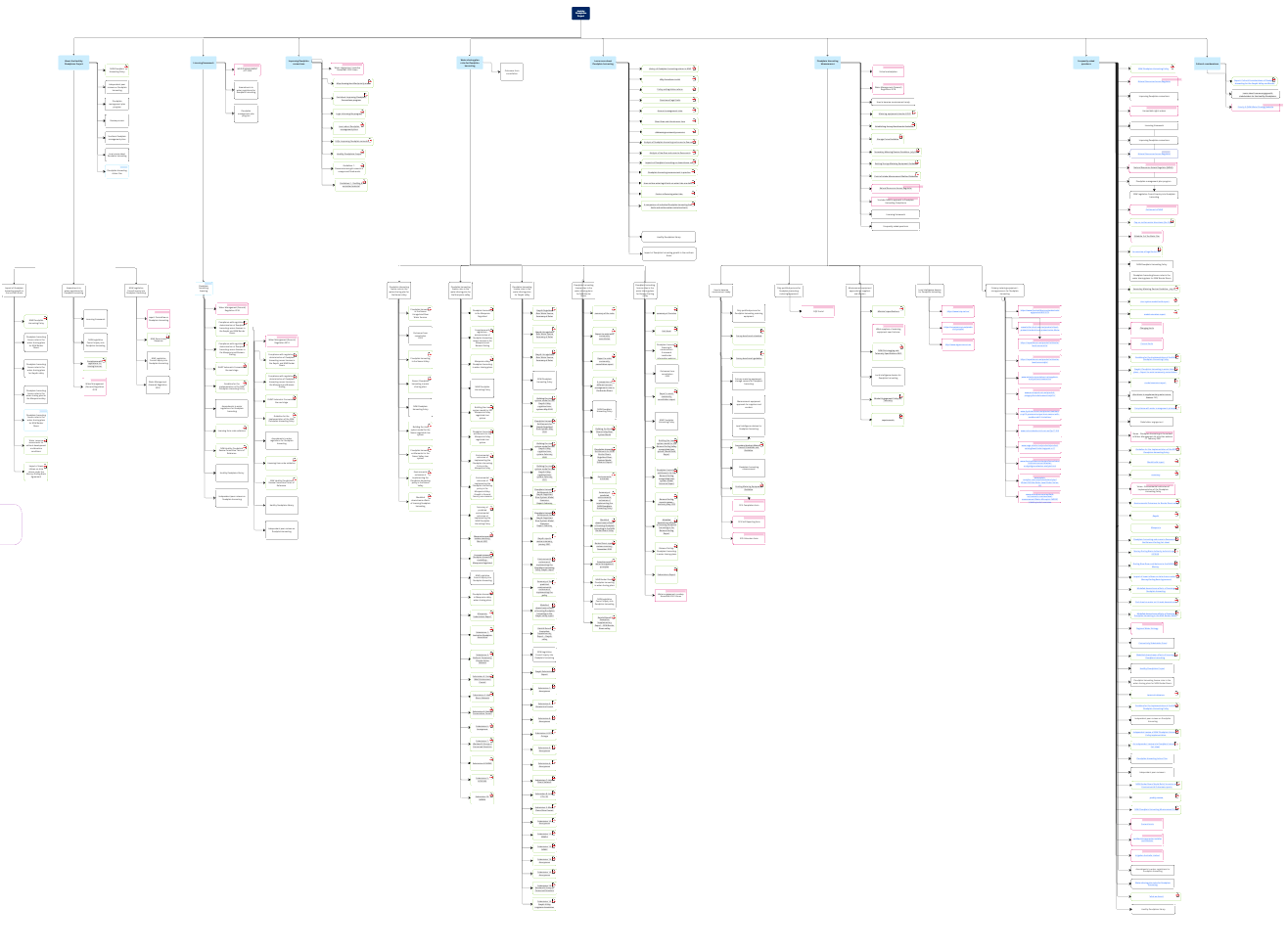
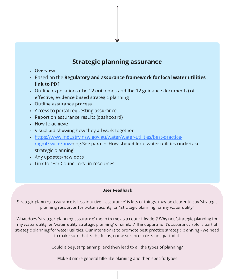
To understand the current website landscapes, I carefully looked at the way information was organised and created some IA (Information Architecture) sitemaps. I found problems like broken links and PDF attachments and outlined these within the IA. I worked with our content writer to come up with important questions that would help us figure out what users need, what they like, and what problems they face for some user interviews.
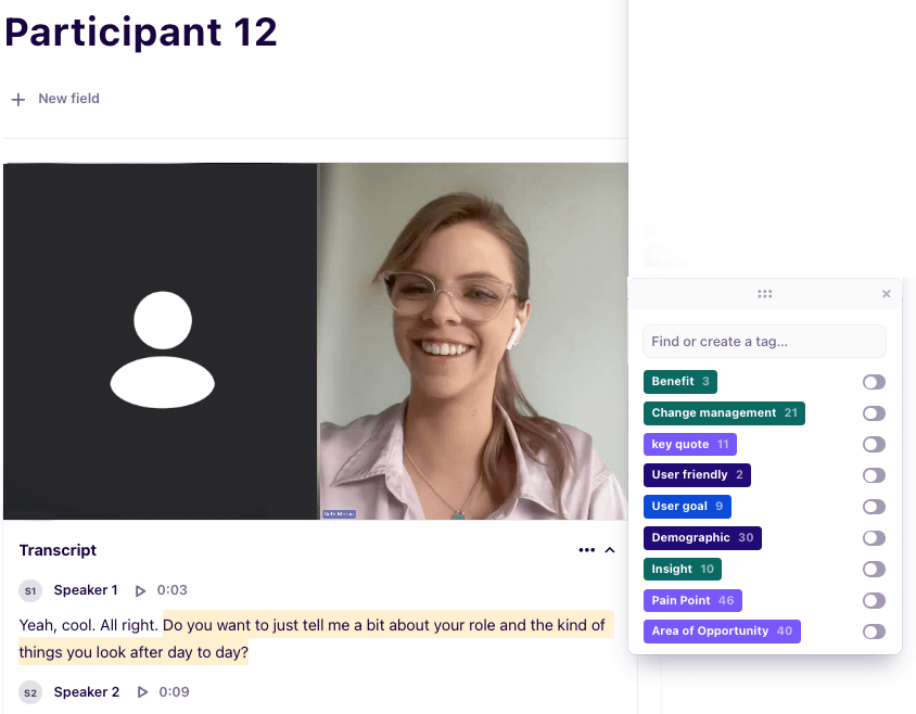
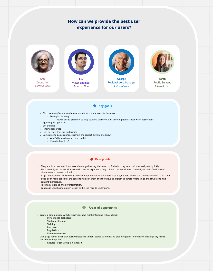
I talked to more than 30 users. I led phone calls or Zoom meetings with small land farmers, big water users, local government councilors, and regional managers. These talks gave us important insights into what they need and the difficulties they face when dealing with regulations.
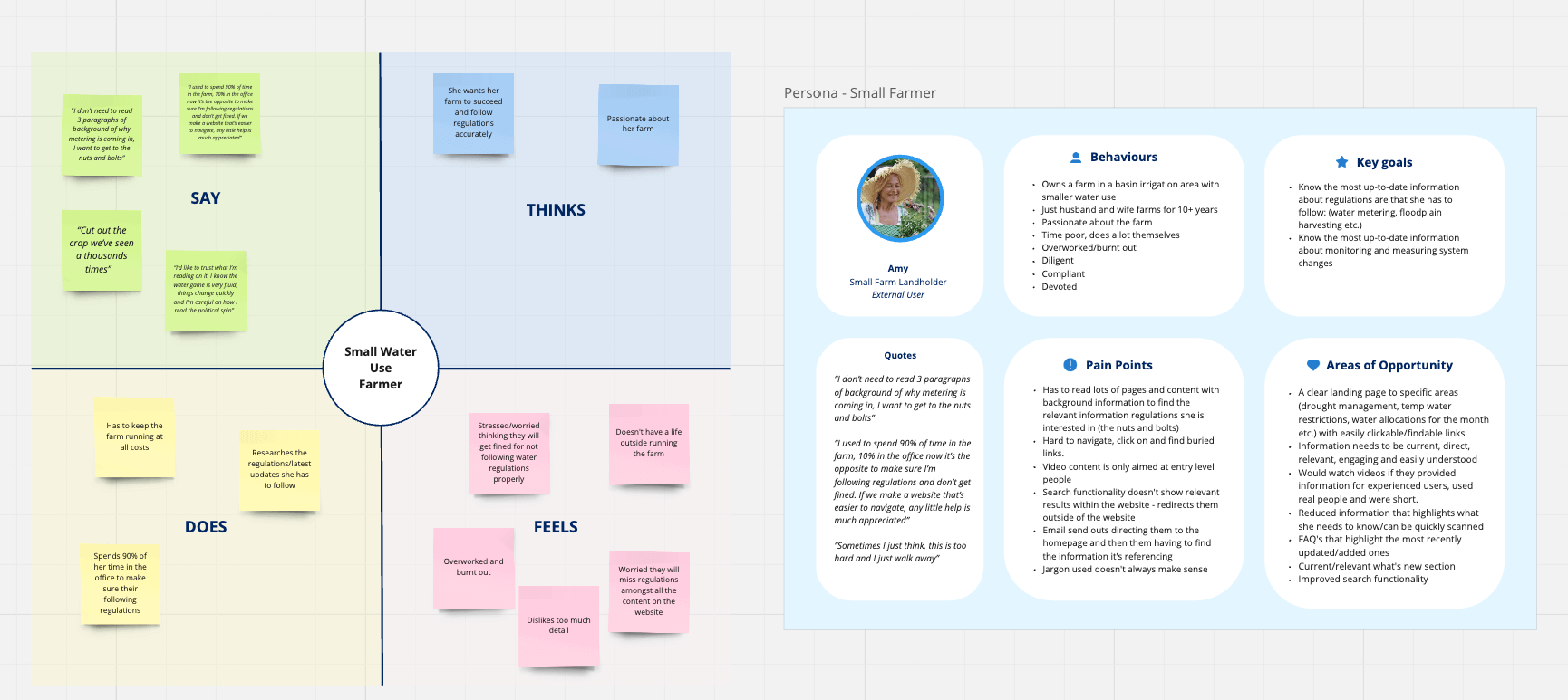
During my research, a clear example of the problem highlighted by stakeholders came up. A small farmer shared that they missed important measurement requirements before because the information on the website was buried and not clear. This had a real impact – the farmer, who once spent 10% of their time in the office and 90% on the farm, had to reverse their time allocation to avoid fines. They couldn't dedicate as much time to what they loved or what brought in revenue anymore because they were afraid of missing regulation guidelines. This user's experience highlighted the urgent need for a simpler, plain English approach, making sure important information stands out to avoid missing crucial details.
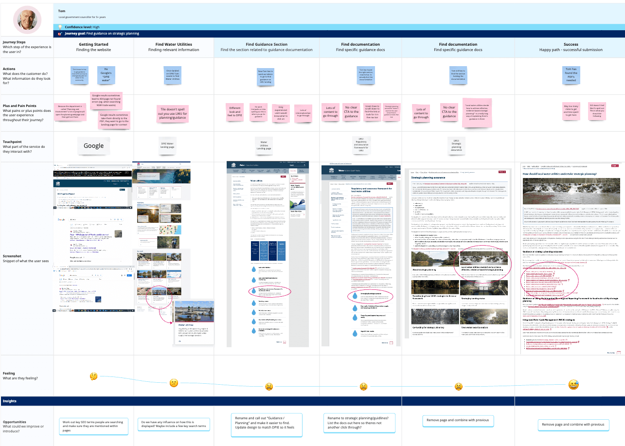
I used Dovetail software to mark important topics that came up in the interviews. This helped me gather the main themes from each interview and put them together to figure out overall findings. It also allowed me to create specific personas that represent different types of users. Creating current user journeys helped us understand how users engage and the number of steps required to locate important regulation pages and sections. Empathy maps also offered a deeper understanding of each persona's thoughts, emotions, and actions.
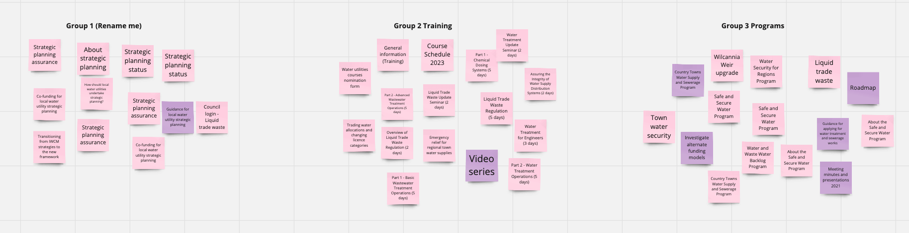
I facilitated card sorting workshops with stakeholders and experts, merging their know-how with what end-users think. This teamwork served two purposes: we wanted to learn from their expertise, and we also aimed to help stakeholders better understand what users need for the redesign. By merging their insights with user feedback, the goal was to foster an environment where everyone could grasp the reasoning behind the upcoming proposed changes.
When I shared the main findings and suggested IA structures, some stakeholders weren't on board at first. Faced with significant pushback, I had one-on-one follow-up meetings to understand and include everyone's concerns. Afterward, I worked with key stakeholders in a group meeting to ensure everyone heard diverse opinions. Together, we explored various ways to name and organize information while still complying with regulations. I revisited and emphasised crucial quotes from user feedback, placing them next to some of their suggestions. This was to question ideas that I believed might not be helpful for users and to remind everyone how it could be perceived by the end-users.
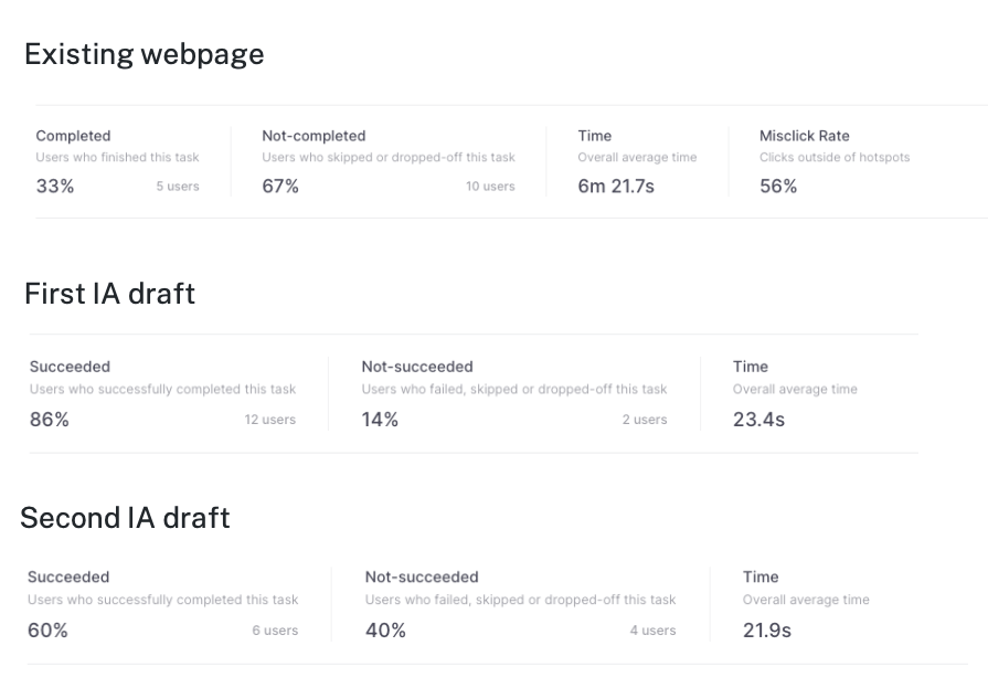
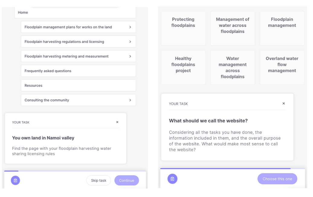
After that, we did more rounds of user tree testing to see if the versions influenced by stakeholders actually made the user experience better. But, because users were still having trouble with the new IA, we had to make several changes to find the right balance between what stakeholders wanted and what users needed.
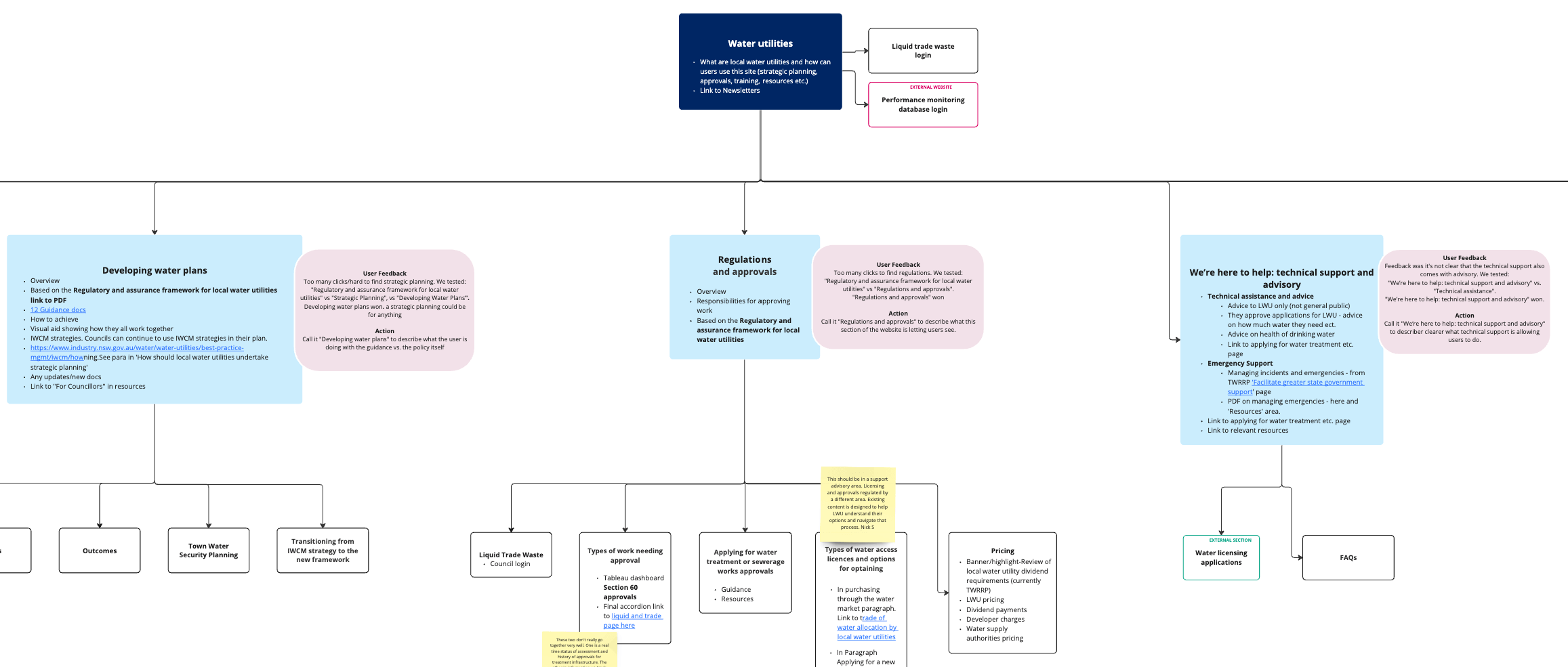
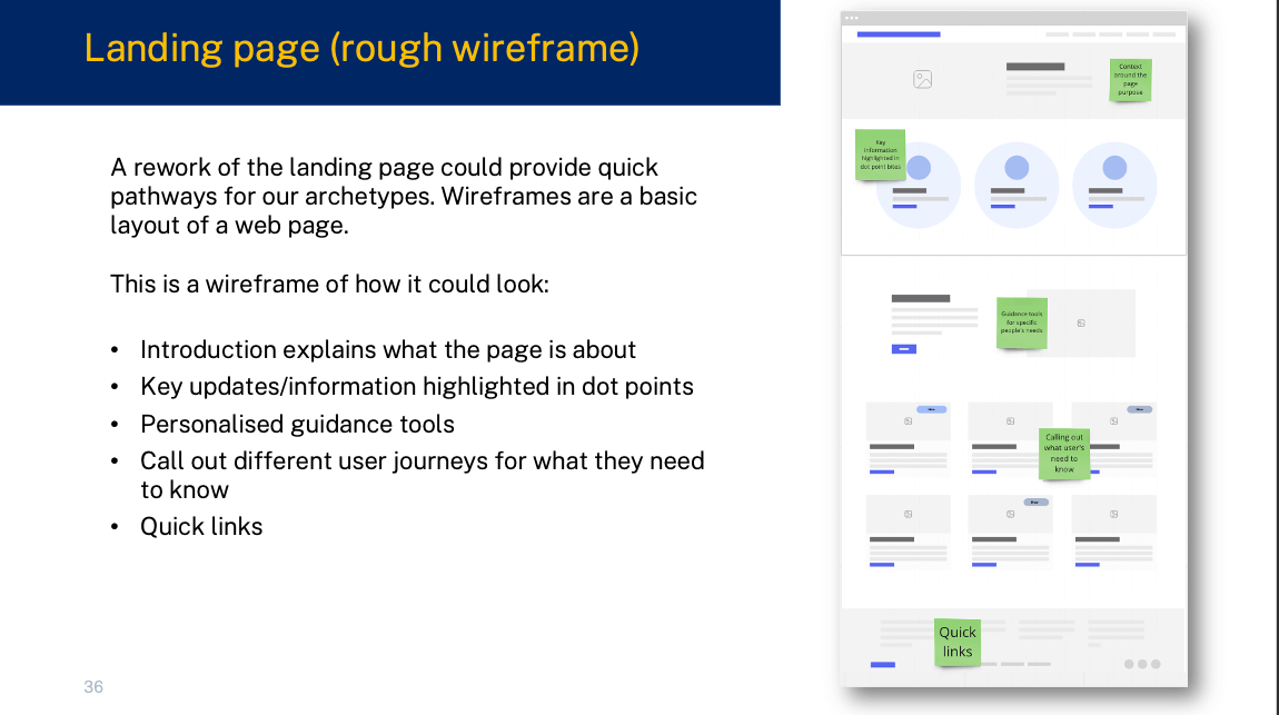
Once I got everyone on the same page, I passed on the IA and UX suggestions, along with wireframes, to the UI designers and content writers. Their skills were crucial in turning insights into designs that look good and content that's clear and in plain English for a diverse audience.
This case study tells the story of aligning project goals, understanding user needs, and finding a balance between stakeholder expectations and user preferences. Despite the final testing results for the new design not being perfect, there was a significant improvement in user satisfaction and understanding. While the last version had its flaws, it demonstrated a noteworthy 70% increase in users finding what they needed and understanding the website's language.
This improvement shows that our design process made a positive difference, emphasising the ongoing need to make changes as user needs evolve. Getting past initial challenges, having one-on-one follow-up sessions, and doing repeated user tree testing were crucial in getting everyone on the same page. The teamwork with stakeholders, thorough user testing, and our design process all came together to give the website a makeover. Now, it not only follows rules and regulations but also greatly improves the overall experience for a diverse audience.