In this case study, I delve into my role as the leader of a four-person team in a user research project for the Australian NSW Government of Environment and Planning. I discuss how we tailored a website template from Deloitte to more effectively convey the unique story of Sydney Olympic Park, emphasising sustainability, community, and culture. Our goal was to see if the updated website effectively got Sydney Olympic Park's message across to its users.
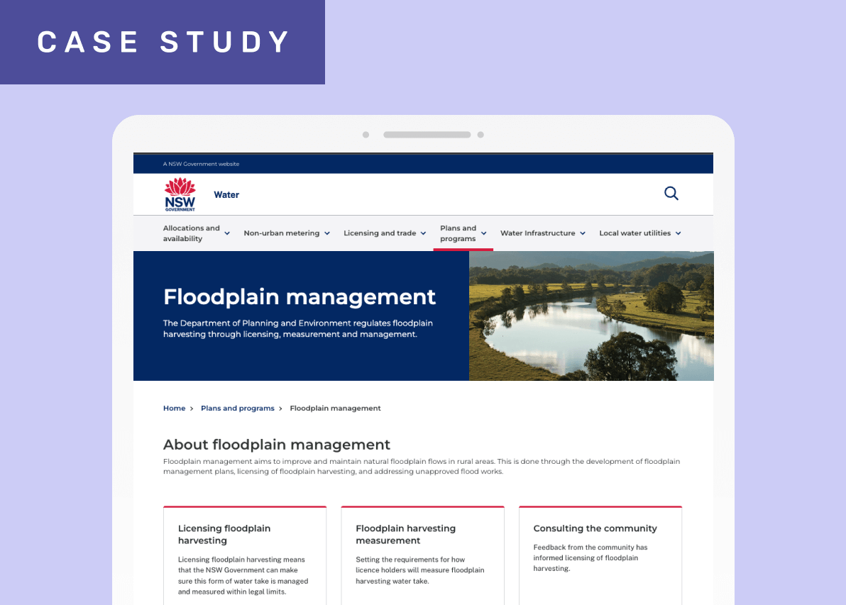
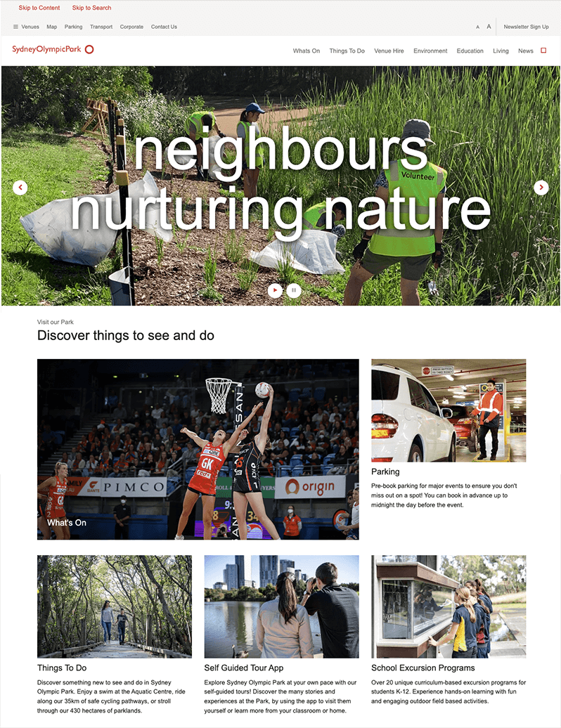
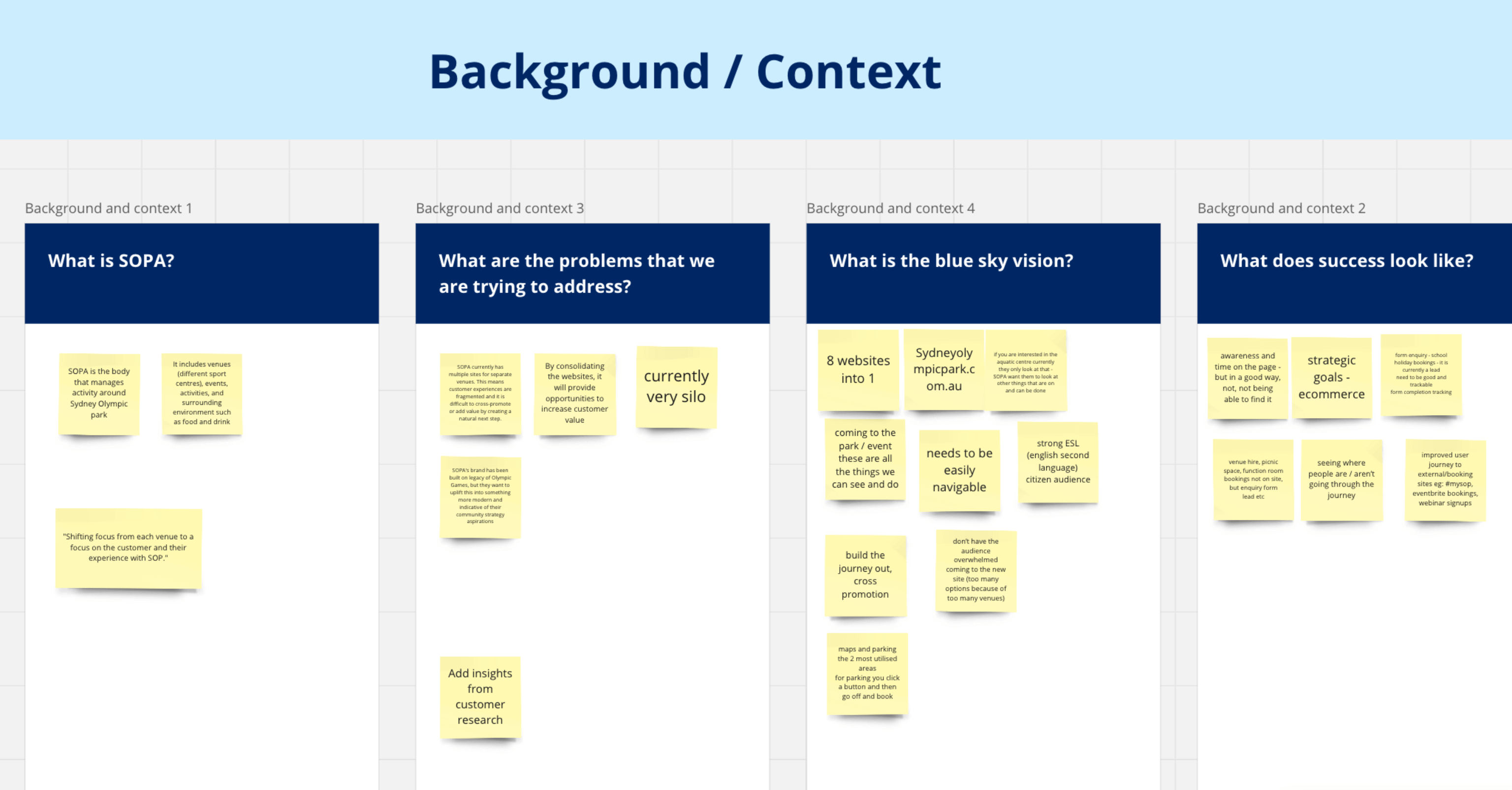
Sydney Olympic Park (SOP), renowned for hosting the 2000 Summer Olympics, received feedback regarding its website's lack of personality and failure to integrate the park's diverse components into a cohesive and harmonious online platform. Seeking enhancement, SOP aimed to showcase its vibrant community, commitment to eco-friendliness, and diverse cultural offerings through an improved website experience.
The objective was to refine a new website template to effectively convey the park's unique story while ensuring users could easily find the information they required. With statistics indicating a significant portion of users spoke English as a second language, it was essential to validate that they could comprehend and navigate the website effortlessly to locate their desired content.
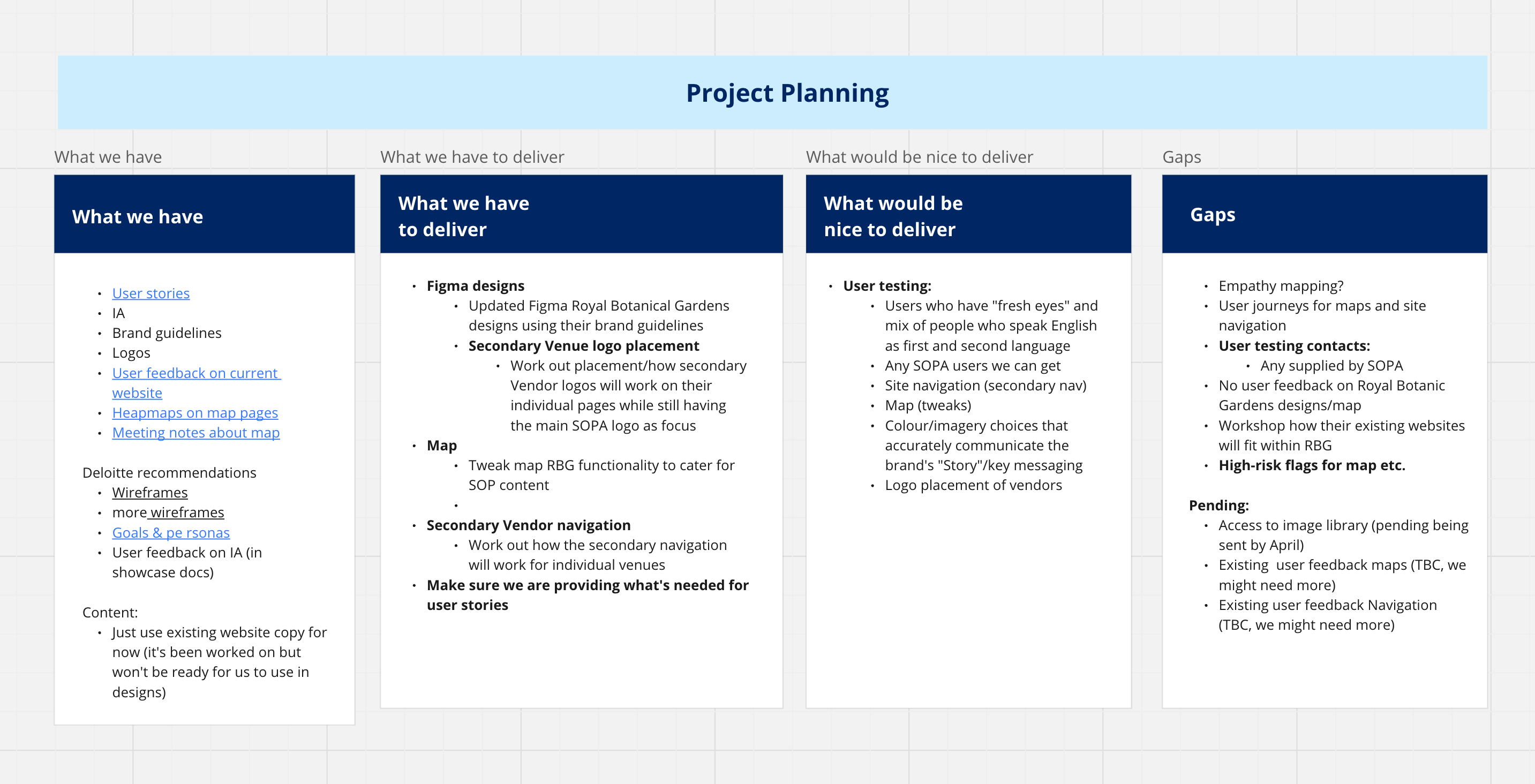
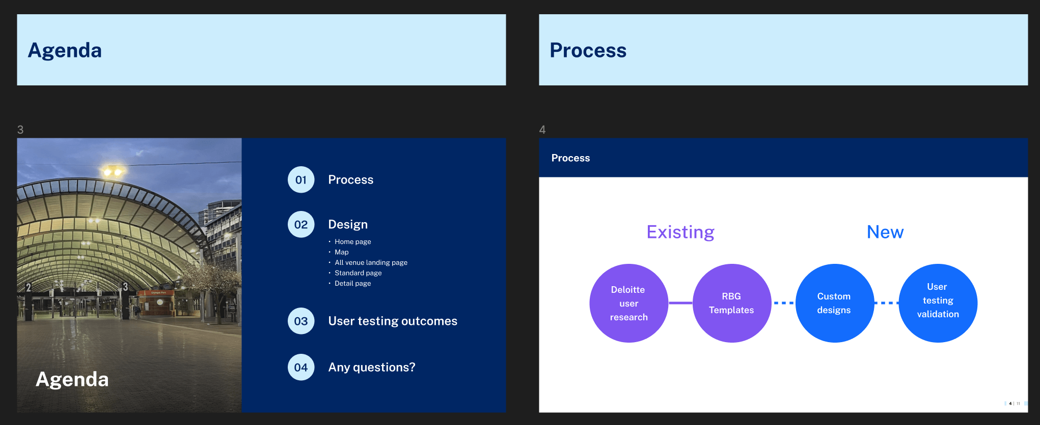
I looked closely at the user research done previously by Deloitte agency, figuring out what they had already done and what was missing. After that, I made a plan for our team to do more research, study the results, and make changes to the design. I worked with the team to assign tasks, and we agreed on how to move forward using Miro and Jira.
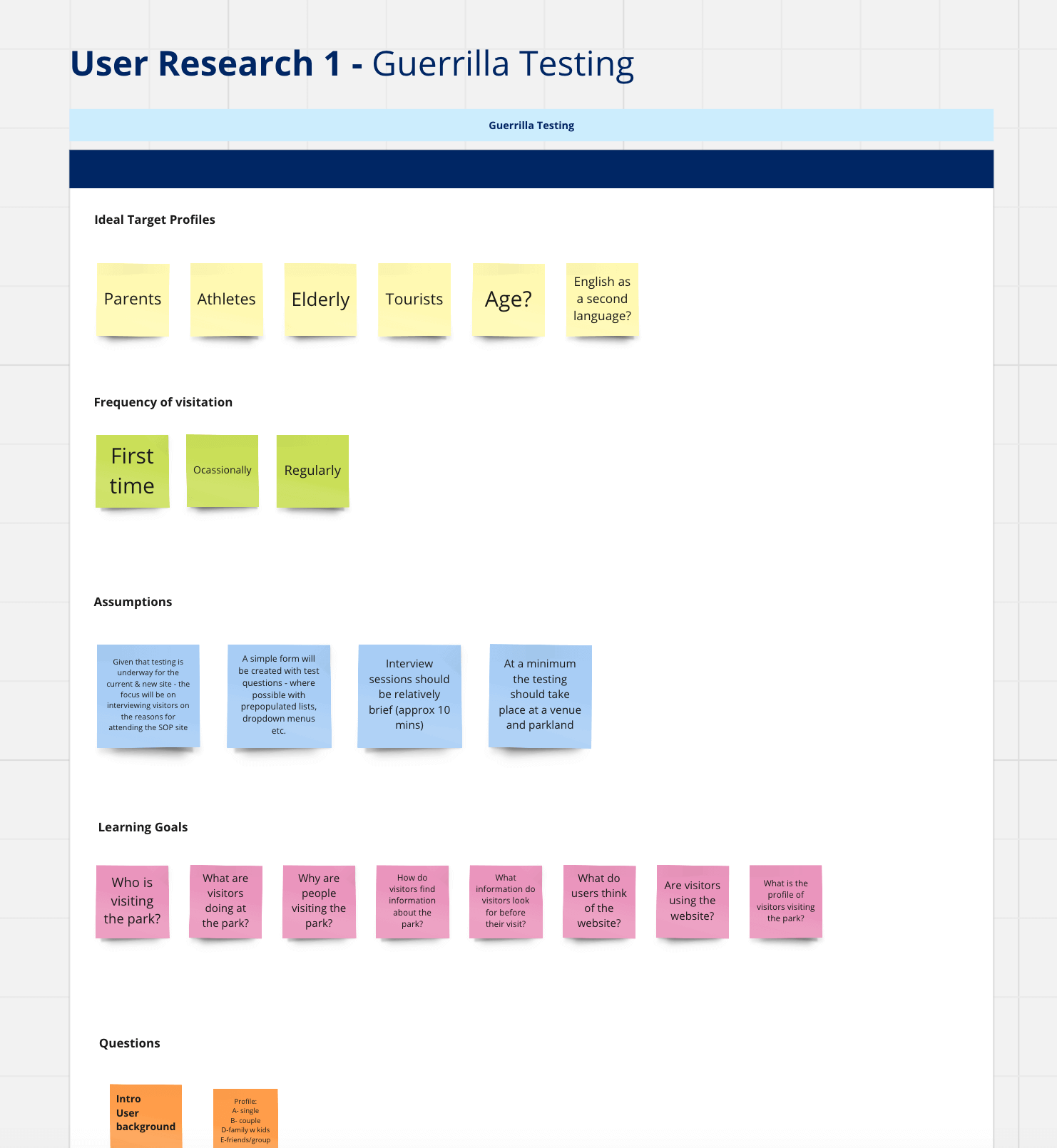
I organized collaborative kick-off workshops with stakeholders from Sydney Olympic Park (SOP) to delve into crucial narratives, cultural highlights, existing challenges, potential risks, and their vision of success. I then helped aligned the team's vision with the organisation's goals to create a cohesive strategy for the website redesign. A big call out was that stakeholders also agreed that the website currently received a lot of first-time users who spoke English as a second language (ESL). So, it was crucial to get new viewpoints on how clear the main features were for these users.
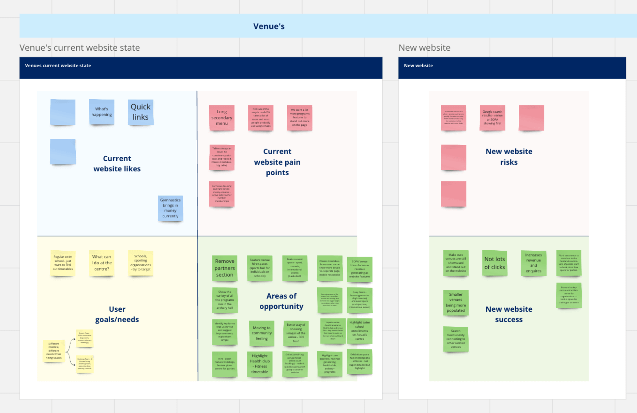
As the project leader guiding the team, I led a planning session to map out our strategy for user research. Together, we came up with a plan that included the methods we'd use, who we were targeting, any assumptions we had, our goals, and a set of questions to get specific insights. We recognized the need to prioritize things, so we sorted elements into what was less and more important, making our research process more efficient.
After looking at the team's plans, I gave helpful feedback, stressing the importance of asking questions that directly related to what we wanted to find out. This teamwork was meant to improve our research methods, making sure each question was carefully crafted to reveal the key insights we needed for the success of our user experience efforts.
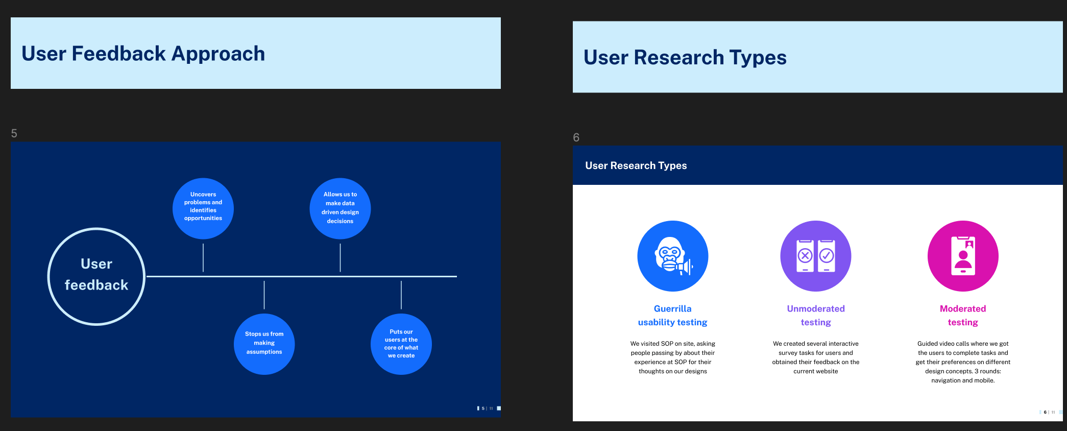
To guarantee an improved experience for SOP's website users, we adopted a multifaceted approach to ensure feedback from diverse perspectives. Our testing methodologies included:
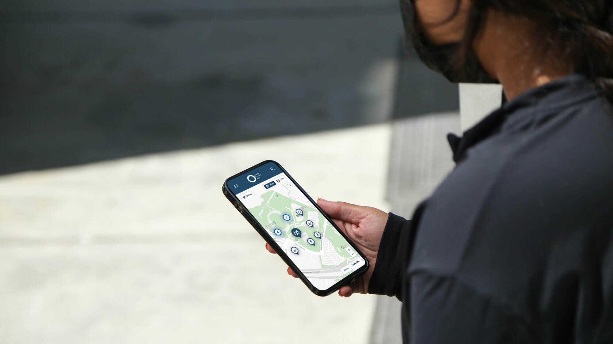
On-site Engagement: Immerse yourself in the user's world. We visited SOP, chatting with people as they walked by to hear about their experiences and gather quick feedback on our design ideas. We engaged with several users who spoke English as a second language to gain insight into their unique perspectives and reactions regarding their interpretation of the website. Their feedback provided valuable insights into the key information they sought and their preferred navigation pathways.
Additionally, we used the opportunity to get inspired by the park and different venue settings, figuring out inventive ways to include its unique elements in our design concepts.
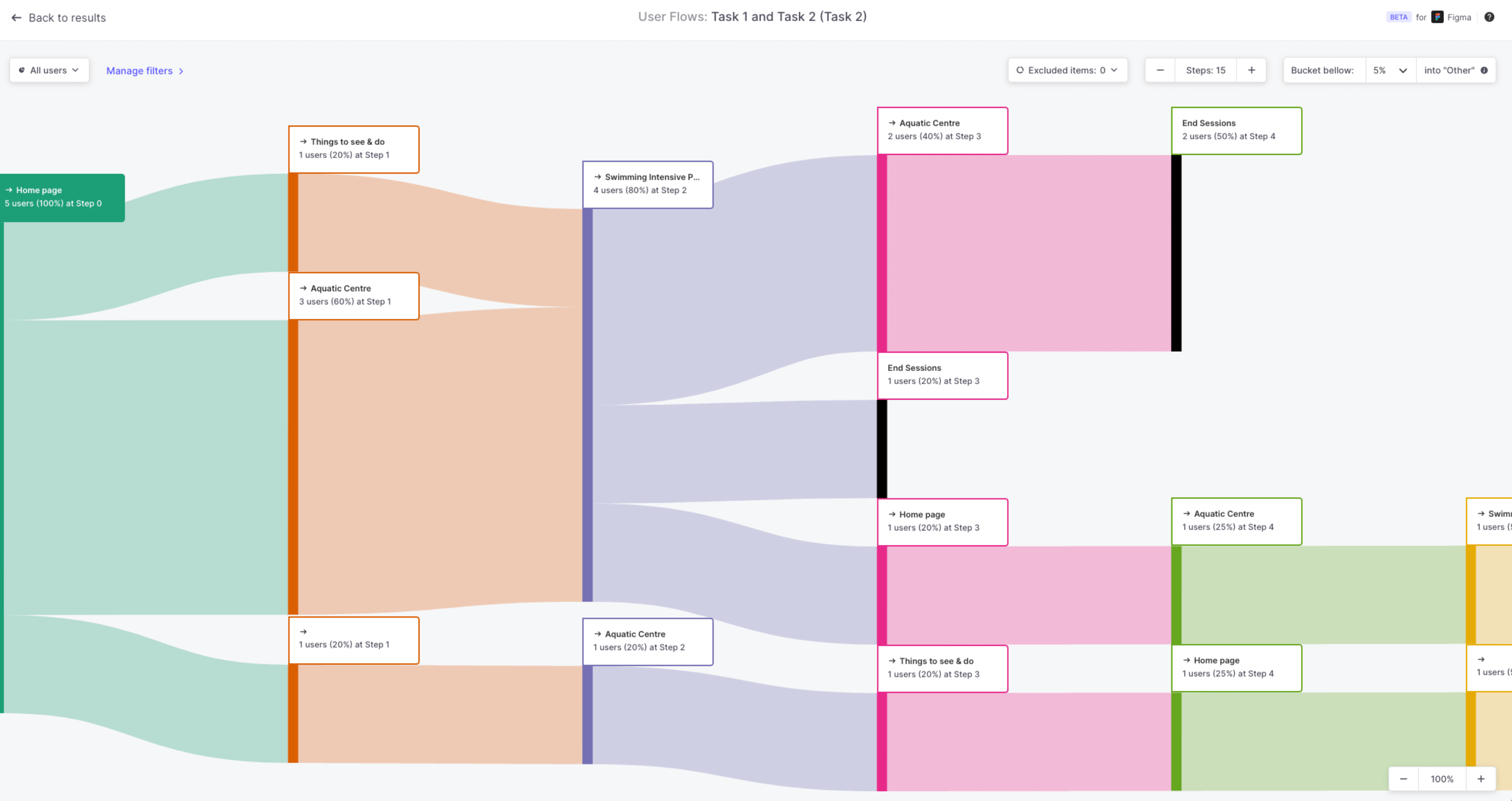
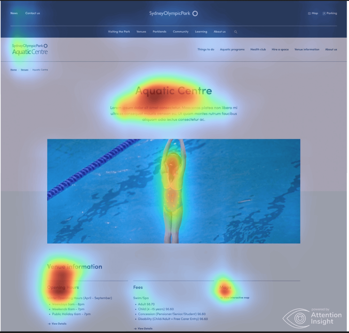
Interactive Surveys and Tasks: We used Useberry (a user testing platform) to create interactive survey tasks that let users navigate and interact with the existing website. Their direct feedback provided valuable insights, guiding us in improving our design approach. This included gathering input on aspects like the ease of navigation, understanding icons, and tracking where users clicked on the website.
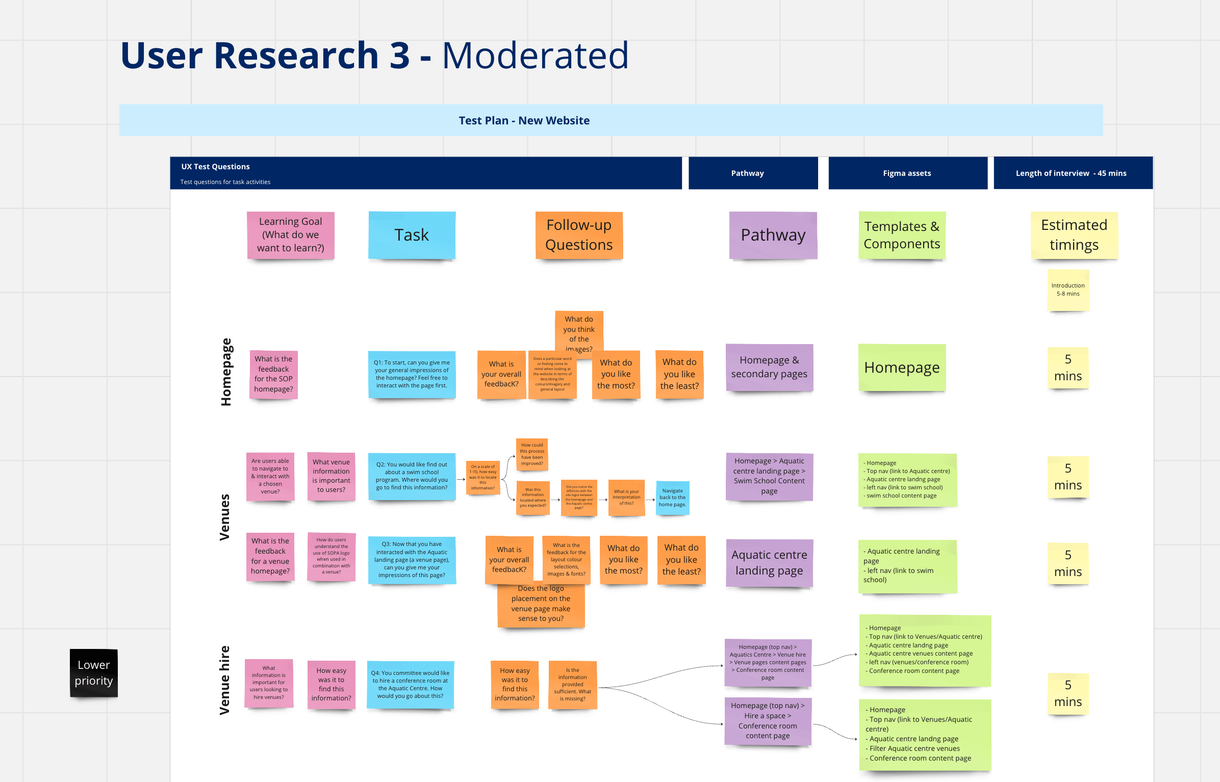
Guided Video Calls: For a more in-depth understanding, we conducted moderated testing through video calls. This allowed us to hear users live reactions through specific tasks, observing their interactions and gauging preferences on different design concepts.
Three Rounds for Precision: We did three rounds of moderated testing, each focusing on different things – the first one looking at navigation, the second at how well it worked on mobile, and the third at overall user satisfaction. This organised approach made sure we thoroughly checked how the website worked and looked across important aspects.
By combining guerrilla usability testing for real-world insights, unmoderated testing for scalable feedback, and moderated testing for in-depth analysis, we were able to really understand how users interact, what they like, and what challenges they face. This thorough testing approach played a crucial role in creating a website that genuinely connects with SOP's diverse audience.
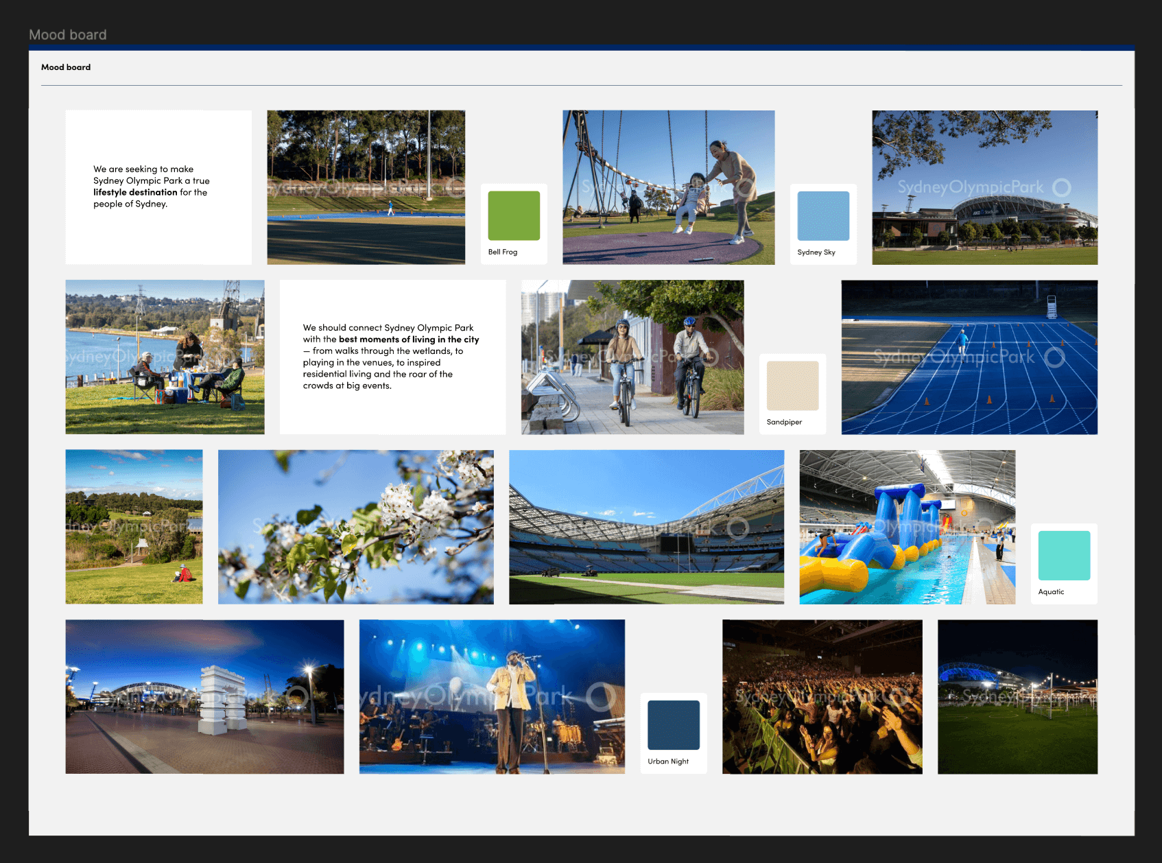
To capture SOP’s key themes of culture and sustainability, the team went on a creative journey by crafting a mood board that visually portrayed these elements. Drawing inspiration from the park's eco-friendly initiatives, we carefully selected colour schemes and imagery that resonated with its commitment to sustainability.
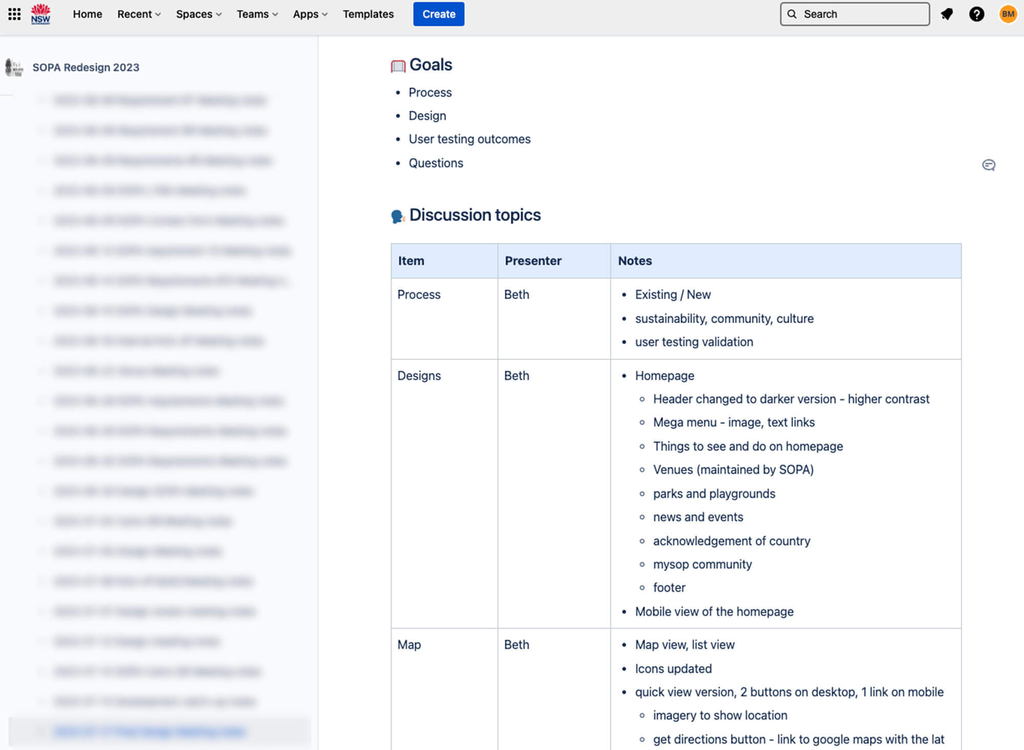
In project management, I took charge by leading daily check-ins and offering crucial guidance to keep the team on track with our goals. Apart from the daily routine, I made sure communication was smooth by noting down tasks and decisions in Jira during meetings with stakeholders. This careful approach not only made everyone accountable but also gave us a reference for future actions. Working closely with the project manager, I played a key role in making a RACI chart, outlining team roles and responsibilities for more efficient project management.
As the communicator, I took charge of presenting updates on the project to the CEO, board members, and internal teams. This highlights how leadership and coordination are crucial for achieving success in UX within a project framework.
Following the conclusion of our research, we needed to effectively convey the narrative of our journey and the rationale behind our decisions to ensure buy-in and support from stakeholders and cross-functional teams. I crafted a presentation to visually illustrate our goals, challenges, methodology, and outcomes. While leading the presentation, I ensured that all key contributors had the opportunity to elaborate on their contributions and enrich our narrative.
During presentations, I consistently strive to imagine the voices of the individuals I've engaged with during my research. I contemplate what they would want to express and the impact their stories had on shaping my designs. It's essential to convey these insights to the broader team, enabling everyone to feel fulfilled in contributing to creating a better experience for those users.
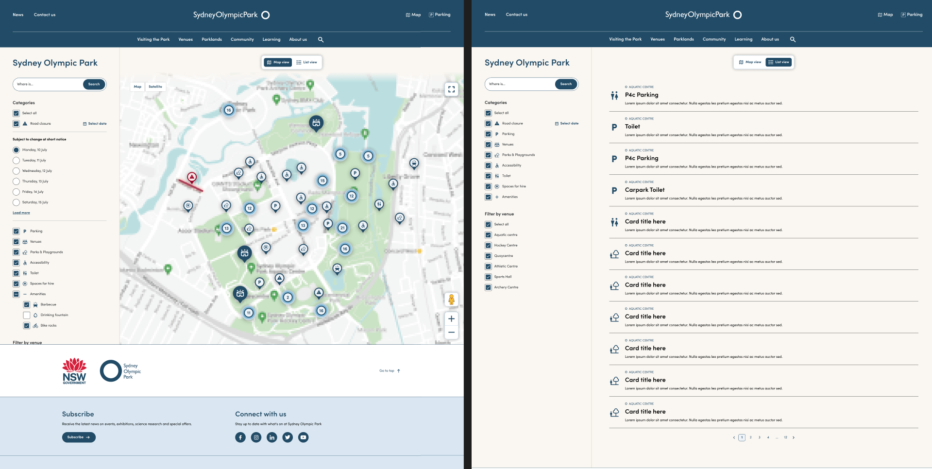
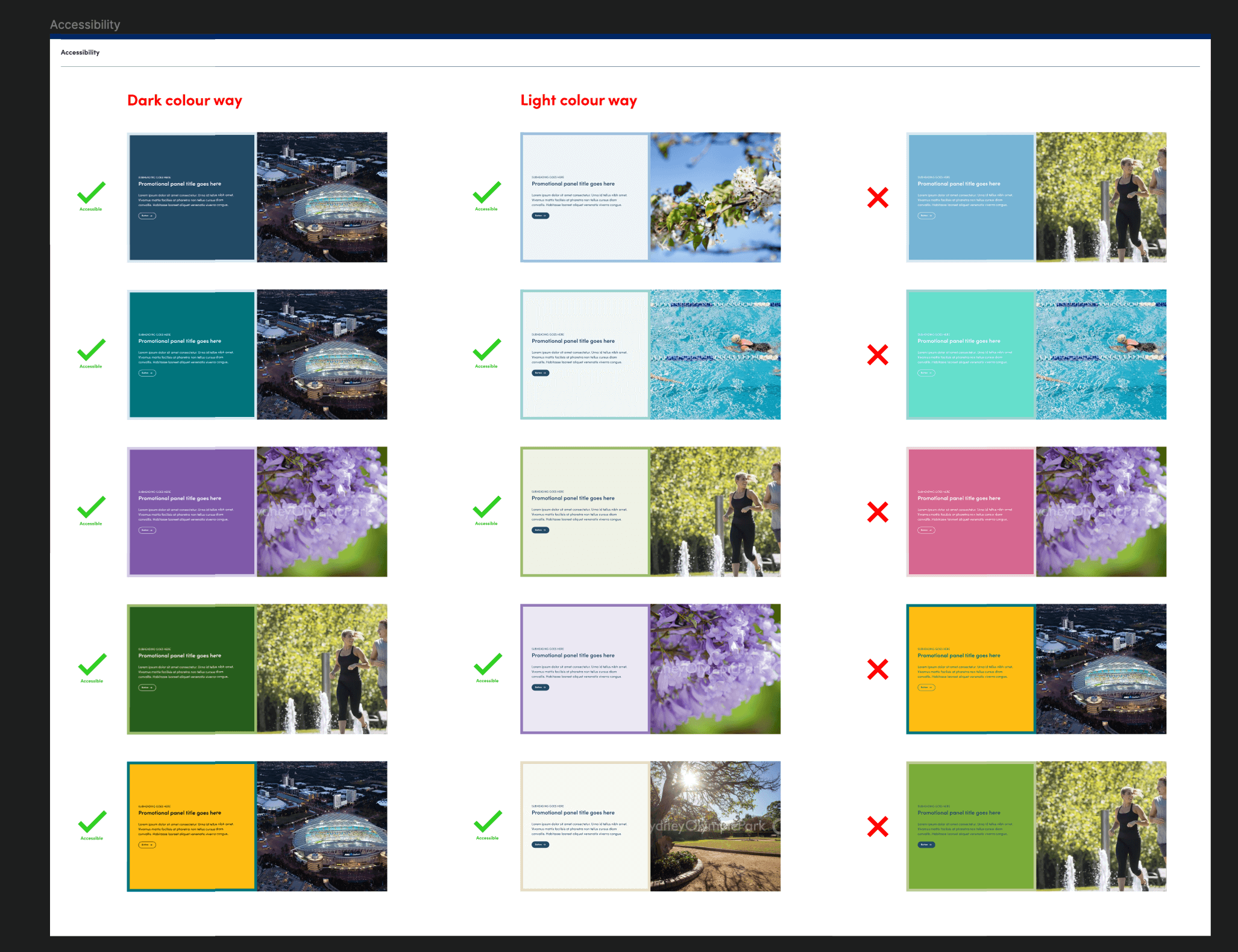
We prioritised inclusivity during the website redesign, incorporating lots of accessibility features to cater to a diverse user base. This involved implementing functionality like a list view on the map for improved usability and ensuring that our chosen color palette adhered to WCAG 2.0 AA compliance.
Key stakeholders at Sydney Olympic Park, including the CEO, praised the new website for accurately reflecting the organisation's values and elevating its online presence. Additionally, we successfully met our deadline for the development handover, ensuring the website's timely creation within timelines.
Looking at what users said about the old and new website, there's a big increase in satisfaction with the new design. People liked the new website because it's easy to navigate, the map is simpler, it looks nice, and the important messages stand out. The fact that users validated our assumptions means we reached our goal for the redesigned website. We didn't solely rely on assumptions to make things aesthetically pleasing; instead, we took action and pivoted based on real-time user research.
By taking the bold step to test, validate, and refine, we successfully integrated the unique perspectives of users who spoke English as a second language. These perspectives, which we might never have encountered otherwise, enriched our understanding and enabled us to incorporate invaluable insights. Giving voice to these users allowed us to contribute meaningfully to enhancing their quality of life.
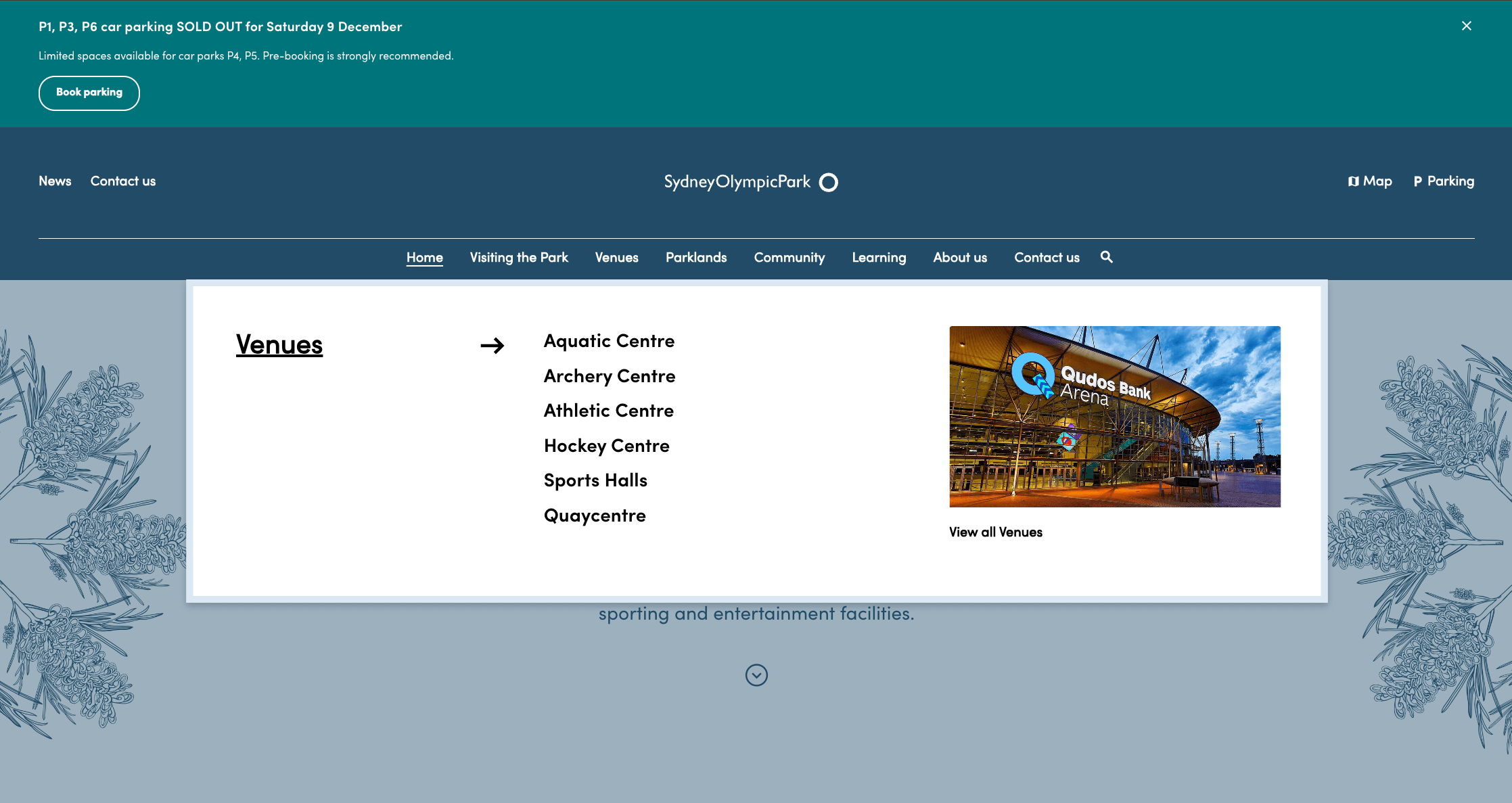
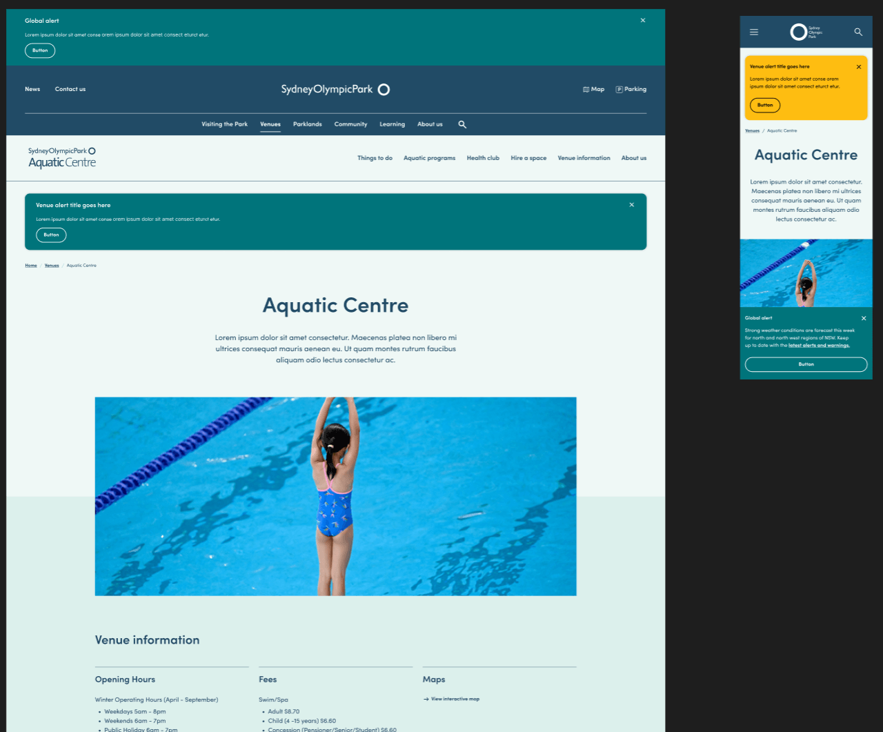
We successfully created a website that captures the attention and effectively narrates the story of Sydney Olympic Park's commitment to sustainability, its vibrant community, and rich cultural experiences, catering to diverse audiences.